Showing posts with label large bodies of text. Show all posts

Sunday, April 7, 2013

Typeface Review: "Warnock"

What It Looks Like:
Picture found here.
Picture found here.
It's History: Designed by Robert Slimbach and published in 2000 by Adobe. As part of the Adobe Originals type composition family, it was named after John Warnock, "the co-founder of Adobe Systems, whose visionary spirit has led to major advances in desktop publishing and graphic arts software.

"A full-featured, state-of-the-art OpenType family - with Latin, Cyrillic, and Greek character sets in a variety of weights and optical size ranges-Warnock Pro is a classic yet contemporary composition family that performs a wide variety of typographic tasks with elegance." (Source #1)
Picture found here.
What Type of Font It Is: Transitional; "Characterized by triangulated serifs and a lively angularity, Warnock is a Transitional with a suggestion of calligraphic form, particularly in the swash letters that form part of a very extended type family." (Source #2)

How You Can Design With It: "Transitionals are, as a general rule, well suited to the setting of large bodies of text, as well as revealing considerable elegance of individual form when used for display purposes.... The italic fonts of Transitional typefaces were designed as an integral part of the face rather than as independent faces, and as a consequence reveal far greater affinity of form with the roman letters, while varying quite widely in style. They are better suited to use for emphasis or differentiation within roman text than the italics of Garalde or Humanist faces." (Source #3)
Picture found here.
Where You Can Get It: You can purchase the font at Fonts.com, MyFonts, Linotype, Typedia, Veer, FontShop, and Adobe Systems Inc.  FontPalace has a free download of Warnock Pro-Bold available.

Descriptive Terms for It: Classic, display, elegant, large blocks of text, large bodies of text, serif, Transitional, and whole family.

Extra: There's even an open letter, penned by Andrei Michael Herasimchuk of Design By Fire, to JohnWarnock to make his namesake a part of the public domain, as well as other typefaces such as Adobe Caslon Pro, Adobe Jenson Pro, Franklin Gothic, Frutiger, Futura, Gill Sans, Helvetica Neue, and Univers.

Sources:
- #1 - http://www.myfonts.com/fonts/adobe/warnock/
- #2 - "The Complete Typographer: A Manual for Designing with Type" by Will Hill, 2nd Edition, p. 91
- #3 - "The Complete Typographer: A Manual for Designing with Type" by Will Hill, 2nd Edition, p. 84

Examples:
Picture found here.
Picture found here.
Picture found here.

Tuesday, March 26, 2013

Typeface Review: "Sabon"

What It Looks Like:
Picture found here.
It's History: "Sabon is an old style serif typeface designed by Jan Tschichold between 1964 and 1967. It was released jointly by Linotype, Monotype, and Stempel foundries in 1967. It’s based on typefaces designed by Claude Garamond, particularly the one printed by Konrad Berner of Frankfurt, as well as the italics by Robert Grandjon." (Source #1)

"One of the finest modern adaptations of the Garamond model, Jan Tschichold's Sabon stands as the culmination of a hugely influential typographic career in which type design developed alongside book typography and critical writing.

"It is names for the punchcutter and type founder Jakob Sabon of Lyons, who is credited with bringing the Garamond types originating with Plantin or Granjon into use in Franfurt, thus introducing the Garamond model into German printing. Sabon is, however, far more than a literal revival, since it incorporates characteristics drawn from the different sizes of the Garamonds to form one consistent and definitively 20th-century interpretation of the ideas that they embody." (Source #2)
Picture found here.
What Type of Font It Is: Garalde - "Garaldes include some of the most attractive and well-designed text faces in current use. They are highly legible but visually lively. As with most historically based faces, the adaptation of these letters for changing print technologies has had varying effects upon their integrity of form.

"All typefaces originating in hand-cut punches showed a considerable variation of form according to size, with the serifs relatively heavier and the modulation of stroke width less pronounced at smaller sizes. These considerations are crucial to the effective design or adaptation of Garalde faces, and distinguish quality recuts and original faces in the Garalde tradition." (Source #3)
Picture found here.
How You Can Design With It: "One of the distinguishing features of Sabon is that the roman, italic, and bold weights all take up the same width when typeset. It’s an unusual feature, but meant that only one set of copyfitting data is needed for all three styles.

"Sabon is a highly legible typeface, with moderate contrast between thick and thin strokes. That makes it suitable for use in a variety of sizes.

"Sabon is a favorite for typesetting book copy, and is well-suited to any traditional or formal design." (Source #1)

"It has an elegant bold font, and it is exceptionally balanced and legible across italic and roman in both its weights. It has a harmonious visual consistency and few obtrusive distinguishing features - an inclined stress, open counters, and a complementary interaction between characters. It incorporates expert set features, including small caps, ligatures, and non-lining numerals." (Source #2)
Picture found here.
Where You Can Get It: You can buy the Sabon font and the whole font family at LinoType, AdobeFonts.com, FontShop, MyFonts, or Webtype.

Descriptive Terms for It: Book copy, Garalde, Jan Tschichold, large blocks of text, large bodies of text, legible, Old Style Serif, serif, traditional, and whole family.

Sources:
- #1 - http://www.webdesignerdepot.com/2011/08/the-most-popular-fonts-used-by-designers/
- #2 - The Complete Typographer: A Manual for Designing with Type" by Will Hill, 2nd Edition, p. 76
- #3 - The Complete Typographer: A Manual for Designing with Type" by Will Hill, 2nd Edition, p. 72

Examples:
Picture found here.
Picture found here.
Picture found here.
Picture found here.
Picture found here.
Picture found here.

Tuesday, March 19, 2013

Typeface Review: "Garamond"

What It Looks Like:
Picture found here.
It's History: "Garamond is an old-style serif typeface, named after punch-cutter Claude Garamond. Adobe Garamond and Stempel Garamond were both based on this original typeface from the 16th century, and Granjon and Sabon were heavily influenced by it. There are a few unique characteristics of Garamond, including the small bowl of the lowercase 'a' and the small eye of the 'e'." (Source #1)

Claude Garamond's
portrait using the font
Garamond.
Picture found here.
"Robert Slimbach redesigned Garamond for Adobe in 1989. "Moderate contrast, and a more rounded form and evenness of stroke than Linotype or Stempel versions, make Slimbach's one of the most readable Garamonds. It is available with swash italics, some elegant terminal letters, ornaments, and titling capitols." (Source #2)

What Type of Font It Is: Garalde - "Garaldes include some of the most attractive and well-designed text faces in current use. They are highly legible but visually lively. As with most historically based faces, the adaptation of these letters for changing print technologies has had varying effects upon their integrity of form.

"All typefaces originating in hand-cut punches showed a considerable variation of form according to size, with the serifs relatively heavier and the modulation of stroke width less pronounced at smaller sizes. These considerations are crucial to the effective design or adaptation of Garalde faces, and distinguish quality recuts and original faces in the Garalde tradition."(Source #3)

Picture found here.
How You Can Design With It: "Garamond’s greatest strength is its legibility and readability. Garamond is one of the most legible serif typefaces, especially for use in print applications. It’s also one of the most eco-friendly typefaces in terms of ink usage. The original punches and matrices were sold to Christopher Plantin upon the death of Claude Garamond, and were in turn used in many printers, adding to its rise in popularity. Garamond revivals were created as early as 1900. Garamond is an excellent choice for printed materials, including books and reports, due to its high legibility in print." (Source #1)

Where You Can Get It: You can buy the font at FontShop. There is also an Apple site that let's you try it out before purchasing it, located here. Or download from a range of cheaper versions of it at DaFont.

Descriptive Terms for It: Book copy, Garalde, large blocks of text, large bodies of text, legible, Old Style, Old Style Serif, readable, redesign, variety, and whole family.

Sources:
- #1 - http://www.webdesignerdepot.com/2011/08/the-most-popular-fonts-used-by-designers/
- #2 - The Complete Typographer: A Manual for Designing with Type" by Will Hill, 2nd Edition, p. 80
- #3 - The Complete Typographer: A Manual for Designing with Type" by Will Hill, 2nd Edition, p. 72

Examples:
Picture found here.
Picture found here.
Picture found here and also available for purchase.
Picture found here.
Picture found here and also available for purchase.

Monday, February 4, 2013

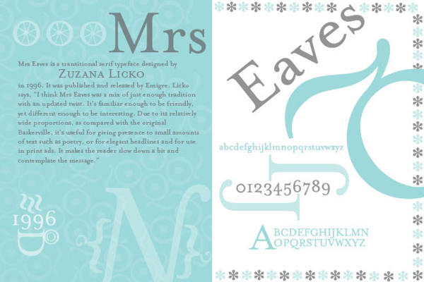
Typeface Review: "Mrs Eaves"

What It Looks Like:
Picture found here.
It's History: Created in 1996 by Zuzana Licko and licensed by Emigre Graphics, "a digital type foundry, publisher and distributor of graphic design centered information based in Berkeley, California, that was founded in 1984 by husband-and-wife team Rudy VanderLans and Zuzana Licko. The type foundry also published Emigre magazine between 1984 and 2005. Note that unlike the word Ć©migrĆ©, Emigre is officially spelled without accents." (Source #1)

"Mrs Eaves is named after Sarah Eaves, the woman who became John Baskerville's wife. As Baskerville was setting up his printing and type business, Mrs. Eaves moved in with him as a live-in housekeeper, eventually becoming his wife after the death of her first husband, Mr. Eaves. Mrs Eaves is a revival of the types of English printer and punchcutter John Baskerville, and is related to contemporary Baskerville typefaces.

"Licko's selection of the name Mrs Eaves reveals an interesting story. Like his types, John Baskerville was, himself, a controversial character. He hired Sarah Eaves as his housekeeper. Eventually her husband Richard abandoned her and their five children, and Mrs Eaves became Baskerville's mistress and eventual helpmate with typesetting and printing. She married Baskerville within a month of her estranged husband's death. Selection of the name Mrs Eaves honors one of the forgotten women in the history of typography." (Source #2)
Picture found here.
What Type of Font It Is: Transitional: "Transitionals are, as a general rule, well suited to the setting of large bodies of text, as well as revealing considerable elegance of individual form when used for display purposes.... The italic fonts of Transitional typefaces were designed as an integral part of the face rather than as independent faces, and as a consequence reveal far greater affinity of form with the roman letters, while varying quite widely in style. They are better suited to use for emphasis or differentiation within roman text than the italics of Garalde or Humanist faces." (Source #3)

How You Can Design With It: Both elegant and with 213 ligatures, it is perfect for those who want classic style for their book or magazine.

"The typeface family includes roman, italic, petite capitals, small capitals, bold, and roman and italic ligatures. Ligatures in all variants of Mrs Eaves include the standard fi, ffi, andfl ligatures, and resurrect the classic eighteenth century ct and st ligatures. A Just Ligatures variant, available in roman and italic, contain a vast array of new ligatures, many incorporating intertwined and swash characters.

"The Mrs Eaves Ligatures sets include 213 ligatures, ranging from the common to the fanciful. The OpenType format fonts contain all 213 ligatures.

"The WordPress logotype is set in Mrs Eaves. It is also used for the titles (but not author names) on the covers and spines of the current Penguin Classics from Penguin Books. Blacktree's Quicksilver wordmark uses Mrs Eaves. Roman and petite caps. Bowdoin College uses Mrs Eaves in the college wordmark and in many other official materials. Radiohead's 2003 album Hail to the Thief prominently used Mrs Eaves in its related artworks." (Source #2)

Where You Can Get It: You may purchase various versions of Mrs Eaves via Emigre's website, located here: http://www.emigre.com/EF.php?fid=109.
Picture found here.

Descriptive Terms For It: book copy, classical, elegant, large bodies of text, legible, ligatures, pretty, serif, Transitional, versatile, variety, and whole family.

Sources:
- #1 - http://en.wikipedia.org/wiki/Emigre
- #2 - http://en.wikipedia.org/wiki/Mrs_Eaves
- #3 - "The Complete Typographer: A Manual for Designing with Type" by Will Hill, 2nd Edition, p. 84


Examples:
Picture found here.
Picture found here.
Picture found here.
Picture found here.
Picture found here.
Picture found here.
Picture found here.
Picture found here.