Showing posts with label headlines. Show all posts

Saturday, March 9, 2013

Typeface Review: "Caslon"

What It Looks Like:
Picture found here.
It's History: "Caslon is a set of serif typefaces with the irregularity common of Dutch Baroque types. It has short ascenders and descenders, bracketed serifs, and is moderately-high contrast. The italics have a rhythmic calligraphic stroke, and some of the lowercase italics have the suggestion of a swash.

"The first Caslon typeface was designed in 1722. It was similar to Dutch Fell types by Voskens, and also by the typefaces cut by Van Dyck, another Dutchman. The Caslon types were used throughout the British Empire, including British North America. The decayed appearance common in a lot of early American printing is often thought to be caused by the oxidation that resulted from long exposure to seawater during the transport of metal type from England to America. Caslon was used extensively, and perhaps most famously in the printing of the U.S. Declaration of Independence." (Source #1)

"The popularity of William Caslon's faces has led to a wide range of typefaces bearing his name. Adobe Caslon, redrawn by Carol Twombly in 1990 from Caslon's 1738 specimens, is a sensitive reconstruction that shows the influence of Dutch old-style faces but also some characteristics of the Transitional forms that were to follow." (Source #2)
Picture found here.
What Type of Font It Is: Garalde; "Garaldes include some of the most attractive and well-designed text faces in current use. They are highly legible but visually lively." (Source #3)

How You Can Design With It: "Caslon is sometimes considered a great universal typeface. There was even a common rule of thumb among printers and typesetters, 'When in doubt, use Caslon.' It’s a versatile typeface that can be used equally well in headings or in body copy. The wide variety of weights and styles available make it even more versatile.

"Caslon can be used for virtually any kind of typesetting, from body copy to headlines, and is quite legible at small sizes." (Source #1)

"Long favored for book work, Caslon remains a text face of unassertive grace, legible in its individual forms and readable in the rhythmic relationships between letters. [...] The face should normally be used at text sizes [as] the Caslon Foundry produced an accompanying titling face, which formed the basis for Matthew Carter's Big Caslon." (Source #2)

Picture found here.

Where You Can Get It: You can purchase the Adobe Caslon typefaces at MyFonts. Or you can download other versions of the typeface at FontYukle, FontSpace, and DaFont.

Descriptive Terms for It: Body copy, Garalde, headlines, legible, and versatile.

Sources:
- #1 - http://www.webdesignerdepot.com/2011/08/the-most-popular-fonts-used-by-designers/
- #2 - The Complete Typographer: A Manual for Designing with Type" by Will Hill, 2nd Edition, p. 79
- #3 - The Complete Typographer: A Manual for Designing with Type" by Will Hill, 2nd Edition, p. 72

Examples:
Picture found here.
Picture found here.
Picture found here.
Picture found here.
Picture found here.
Picture found here.
Picture found here.
Picture found here.

Friday, March 8, 2013

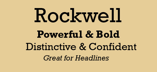
Typeface Review: "Rockwell"

What It Looks Like:
Picture found here.
It's History: "Rockwell is a slab serif, with no real variation in stroke weight. It was designed in-house at Monotype in 1934, supervised by Frank Hinman Pierpont. It’s a geometric typeface, with upper- and lowercase 'O' more of a circle than an ellipse. The serif at the apex of the uppercase 'A' is a distinctive feature of Rockwell that sets it apart from many other serif type faces." (Source #1)

What Type of Font It Is: Slab Serif; "At their best, Slab Serifs are both robust and colorful, with the serifs providing a strong continuity of line. The historic Slab Serifs are generally most effective in the heavier weights.... the substantial serifs and consistent stroke widths retain their form when printed upon rough or absorbent papers or at low digital resolutions. They also survive reversal better than any other serif form, and are excellent for display and semi-display contexts. They were widely used in publishing, packaging, and art/editorial design in the late 1950s and early 1960s." (Source #2)

"Rockwell is a largely geometric face with a well-defined slab serif and is available in four weights. Rockwell has a fairly high x-height and noticeably short descenders. The italic is a somewhat undeveloped oblique form of the roman." (Source #3)
Picture found here.
How You Can Design With It: "The geometric forms of Rockwell make it more similar to sans-serif typefaces, making it a good choice for combining with geometric sans serifs.

"Rockwell is best-suited for use as a display typeface due to its thick, monoweighted strokes." (Source #1)

Where You Can Get It: You can buy it at Fonts.com, or you can purchase all the complete pack from Monotype Design Studio.

Descriptive Terms for It: Display, headlines, poster design, Slab serif, and serif.

Bonus: Here is a very well constructed video describing "Rockwell". Enjoy!

Sources:
- #1 - http://www.webdesignerdepot.com/2011/08/the-most-popular-fonts-used-by-designers/
- #2 - The Complete Typographer: A Manual for Designing with Type" by Will Hill, 2nd Edition, p. 102
- #3 - The Complete Typographer: A Manual for Designing with Type" by Will Hill, 2nd Edition, p. 105

Examples:
Picture found here.
Picture found here.
Picture found here.
Picture found here.
Picture found here.
Picture found here.