Showing posts with label poster design. Show all posts

Tuesday, April 23, 2013

Typeface Review: "Gill Sans"

What It Looks Like:
Picture found here.
It's History: "Gill Sans is a humanist sans-serif typeface created in 1926 by Eric Gill. It was developed further, into a complete type family, after being commissioned by Stanley Morison to compete with the families of Erbar, Futura, and Kabel. In 1928, Gill Sans was released by Monotype Corporation.

"The uppercase characters of Gill Sans are based on Roman capitals like those found in Caslon and Baskerville. There are fourteen styles in the family. Gill Sans is distributed as a system font with Mac OS X and is bundled with some Microsoft products as Gill Sans MT." (Source #1)

"Originally designed as a display face, like the Johnston Underground letters to which it owes a considerable debt of influence, the clarity of Gill Sans subsequently led to its adoption as a text face. Gill Sans is a quintessential Humanist Sans typeface: a monoline form based upon classical proportions. [Eric] Gill was primarily a lettercutter, who approached the industrial processes of commercial type design with some initial reluctance, and his first face for Monotype reflects his grounding in the proportions of the Roman letter." (Source #2)
Picture found here.
What Type of Font It Is: Humanist Sans Serif - "Within the context of sans serif faces, the term 'Humanist' refers to faces based upon a classical or early Humanist model, in which the underlying proportions are derived from the Roman capital letter.

"Humanist Sans typefaces function well for the setting of extended text, though they do not as a rule provide for very economical setting because most have a lower x-height than the Grotesques. Heavier weights may be effectively used for smaller quantities of text, and benefit from generous leading.

"Humanist Sans faces are notable for their compatibility with classic serif types, and can be paired with a number of Humanist, Garalde, and Transitional faces that are based upon similar Roman proportions." (Source #3)
Picture found here.
How You Can Design With It: "Gill Sans has a less mechanical feel to it than typefaces like Futura, because of its basis in Roman tradition. The lowercase letters are modeled on the lowercase Carolignian script, which is especially noticeable in the two-story lowercase “a” and “g”. This basis in traditional, classical typefaces gives Gill Sans a more refined look than many other sans serif typefaces.

"Gill Sans is ideal for display uses, and can be used successfully as a text font at larger sizes. It’s best suited for modern designs, though it can be combined successfully with more traditional typefaces for classic designs." (Source #1)

Where You Can Get It: You can purchase it at LinoType, MyFonts, FontShop, WebtypeFonts.com, Ascender FontsMicrosoft, and Adobe. You can also download a free version at UFonts and FontPalace.

Descriptive Terms for It: 1920s, classic, display, Eric Gill, Humanist Sans, modern, poster, poster design, and sans serif.

Picture found here.
Sources:
- #1 - http://www.webdesignerdepot.com/2011/08/the-most-popular-fonts-used-by-designers/
- #2 - "The Complete Typographer: A Manual for Designing with Type" by Will Hill, 2nd Edition, p. 112
- #3 - "The Complete Typographer: A Manual for Designing with Type" by Will Hill, 2nd Edition, p. 110

Examples:
Picture found here.
Picture found here.
Picture found here.
Picture found here.
Picture found here.
Picture found here.
Picture found here.
Picture found here.
Picture found here.
Picture found here.
Picture found here.

Friday, March 8, 2013

Typeface Review: "Rockwell"

What It Looks Like:
Picture found here.
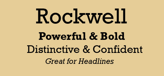
It's History: "Rockwell is a slab serif, with no real variation in stroke weight. It was designed in-house at Monotype in 1934, supervised by Frank Hinman Pierpont. It’s a geometric typeface, with upper- and lowercase 'O' more of a circle than an ellipse. The serif at the apex of the uppercase 'A' is a distinctive feature of Rockwell that sets it apart from many other serif type faces." (Source #1)

What Type of Font It Is: Slab Serif; "At their best, Slab Serifs are both robust and colorful, with the serifs providing a strong continuity of line. The historic Slab Serifs are generally most effective in the heavier weights.... the substantial serifs and consistent stroke widths retain their form when printed upon rough or absorbent papers or at low digital resolutions. They also survive reversal better than any other serif form, and are excellent for display and semi-display contexts. They were widely used in publishing, packaging, and art/editorial design in the late 1950s and early 1960s." (Source #2)

"Rockwell is a largely geometric face with a well-defined slab serif and is available in four weights. Rockwell has a fairly high x-height and noticeably short descenders. The italic is a somewhat undeveloped oblique form of the roman." (Source #3)
Picture found here.
How You Can Design With It: "The geometric forms of Rockwell make it more similar to sans-serif typefaces, making it a good choice for combining with geometric sans serifs.

"Rockwell is best-suited for use as a display typeface due to its thick, monoweighted strokes." (Source #1)

Where You Can Get It: You can buy it at Fonts.com, or you can purchase all the complete pack from Monotype Design Studio.

Descriptive Terms for It: Display, headlines, poster design, Slab serif, and serif.

Bonus: Here is a very well constructed video describing "Rockwell". Enjoy!

Sources:
- #1 - http://www.webdesignerdepot.com/2011/08/the-most-popular-fonts-used-by-designers/
- #2 - The Complete Typographer: A Manual for Designing with Type" by Will Hill, 2nd Edition, p. 102
- #3 - The Complete Typographer: A Manual for Designing with Type" by Will Hill, 2nd Edition, p. 105

Examples:
Picture found here.
Picture found here.
Picture found here.
Picture found here.
Picture found here.
Picture found here.

Saturday, March 2, 2013

Graphic Designer of the Month: Stefan Sagmeister

Picture found here.
A Short Biography: Stefan Sagmeister, born 1962 in Bregenz, Austria, is a New York-based graphic designer and typographer. He has his own design firm—Sagmeister & Walsh Inc.—in New York City. He has designed album covers for Lou Reed, OK Go, The Rolling Stones, David Byrne, Aerosmith and Pat Metheny.

"Things I Have Learned"
book cover.
Picture found here.
Sagmeister studied graphic design at the University of Applied Arts Vienna. He later received a Fulbright scholarship to study at the Pratt Institute in New York. He began his design career at the age of 15 at Alphorn, an Austrian Youth magazine, which is named after the traditional Alpine musical instrument.

In 1991, he moved to Hong Kong to work with Leo Burnett's Hong Kong Design Group. In 1993, he returned to New York to work with Tibor Kalman's M&Co design company. His tenure there was short lived, as Kalman soon decided to retire from the design business to edit 
Colors magazine for the Benetton Group in Rome.

The Rolling Stones
Bridge to Babylon.
Picture found here.
Stefan Sagmeister proceeded to form the New York based Sagmeister Inc. in 1993 and has since designed branding, graphics, and packaging for clients as diverse as the Rolling Stones, HBO, the Guggenheim Museum and Time Warner. Sagmeister Inc. has employed designers including Martin Woodtli, and Hjalti Karlsson and Jan Wilker, who later formed Karlssonwilker.

Stefan Sagmeister is a long-standing artistic collaborator with musicians David Byrne and Lou Reed. He is the author of the design monograph "Made You Look" which was published by Booth-Clibborn editions.

Once in a Lifetime box set.
Picture found here.
Solo shows on Sagmeister, Inc.'s work have been mounted in Zurich, Vienna, New York, Berlin, Japan, Osaka, Prague, Cologne, and Seoul. He teaches in the graduate department of the School of Visual Arts in New York and has been appointed as the Frank Stanton Chair at the Cooper Union School of Art, New York.

His motto is "Design that needed guts from the creator and still carries the ghost of these guts in the final execution."

Sagmeister goes on a year-long sabbatical around every seven years, where he does not take work from clients.

Everything That Happens Will
Happen Today
 album.
Picture found here.
What Is His Specialty: His best known work is probably that of his fantastical album covers for various bands, such as the Once in a Lifetime box set by Talking Heads, for which he received a Grammy Award for "Best Boxed or Special Limited Edition Package" category in 2005. He received a second Grammy Award for his design of the David Byrne and Brian Eno album Everything That Happens Will Happen Today in the Grammy Award for "Best Recording Package" category on January 31, 2010. His album cover for the Rolling Stones record Bridges to Babylon is probably his most featured in books and magazine articles about Graphic Design.

AIGA poster.
Picture found here.
His most famous poster can be argued between his Lou Reed's "Set the Twilight Reeling" promotional poster for the album of the same name, or his AIGA poster featuring typography etched into his skin - his assistant used an E-xacto knife. Now that's passion for your work.

Lou Reed poster.
Picture found here.
About His Work & Influences: In response to an interviewer's question about who influences his work: "Tibor Kalman was the single most influential person in my designy life and my one and only design hero. 15 years ago, as a student in NYC, I called him every week for half a year and I got to know the M&Co receptionist really well. When he finally agreed to see me it turned out I had a sketch in my portfolio rather similar in concept and execution then an idea M&Co was just working on: He rushed to show me the prototype out of fear I’d say later he stole it out of my portfolio. I was so flattered. When I finally started working there 5 years later I discovered it was, more than anything else, his incredible salesmanship that set his studio apart from all the others. There were probably a number of people around who were as smart as Tibor (and there were certainly a lot who were better at designing), but nobody else could sell these concepts without any changes, get those ideas with almost no alterations out into the hands of the public. Nobody else was as passionate. As a boss he had no qualms about upsetting his clients or his employees (I remember his reaction to a logo I had worked on for weeks and was very proud of: “Stefan, this is TERRIBLE, just terrible, I am so disappointed”). His big heart was shining through nevertheless. He had the guts to risk everything, I witnessed a very large architecture project where he and M&Co had collaborated with a famous architect and had spent a years worth of work: He was willing to walk away on the question of who will present to the client. Tibor had an uncanny knack for giving advice, for dispersing morsels of wisdom, packaged in rough language later known as Tiborisms: “The most difficult thing when running a design company is not to grow” he told me when I opened my own little studio. “Just don’t go and spend the money they pay you or you are going to be the whore of the ad agencies for the rest of your life” was his parting sentence when I moved to Hong Kong to open up a design studio for Leo Burnett.
Douglas Gordon's
The Vanity of Allegory.
Picture found here.
These insights were also the reason why M&Co. got so much press, journalists could just call him and he would supply the entire structure for a story and some fantastic quotes to boot. He was always happy and ready to jump from one field to another, corporate design, products, city planning, music video, documentary movies, children books, magazine editing were all treated under the mantra “you should do everything twice, the first time you don’t know what you’re doing, the second time you do, the third time its boring”. He did good work containing good ideas for good people."

Picture found here.
In response to "Who is your personal hero?" he had this to say: "As mentioned, Tibor Kalman, because he had the most guts of any designer I know and understood that spending energy on making sure that a design appears as designed is as important as designing it. Makoto Saito for selling the same photo shoot to different clients. Rick Valincenti for continuously doing ground breaking work. Paula Scher for designing the best project of her career (the type for the New Jersey Performing Art Center), after a 30 year career, last year."

When asked "What advice would you give up-and-coming graphic designers?", he said, "Don't take any advice from tried-and-true graphic designers."

Picture found here.
Where He Can Be Found: Mr. Sagmeister has a website with his design company, Sagmeister & Walsh, where he and his partner, Jessica Walsh, along with some associates, create "identities, commercials, websites, apps, films, books and objects for clients, audiences and ourselves." The website is located here: http://www.sagmeisterwalsh.com/. He also has a Facebook page which you can find here.

Current & Future Projects: Currently, Mr. Sagmeister teaches workshops at the School of Visual Arts while running his design business, Sagmeister & Walsh.

Effect on Graphic Design:

"Sagmeister's CD package designs are what poetry is to prose: distilled, intense, cunning, evocative and utterly complete. His intentions have set a new standard." - I.D. Magazine

Stefan Sagmeister is no mere commercial gun for hire. Sure, he's created eye-catching graphics for clients including the Rolling Stones and Lou Reed, but he pours his heart and soul into every piece of work. His design work is at once timeless and of the moment, and hispainstaking attention to the smallest details creates work that offers something new every time you look at it.

While a sense of humor invariably surfaces in his designs, Sagmeister is nonetheless very serious about his work; his intimate approach and sincere thoughtfulness elevate his design. A genuine maverick, Sagmeister achieved notoriety in the 1990s as the designer who self-harmed in the name of craft: He created a poster advertising a speaking engagement by carving the salient details onto his torso.
Picture found here.
Bibliography:
- Sagmeister, Stefan, et al. Things I Have Learned In My Life So Far. Harry H. Abrams, 2008.

- Sagmeister, Stefan and Peter Hall. Made You Look. Abrams, 2009.

- Sagmeister, Stefan. Another Book About Sales & Promotional Material. Schmidt, 2011.

Sources:
- #1 - http://en.wikipedia.org/wiki/Stefan_Sagmeister
- #2 - http://www.goodreads.com/author/show/240651.Stefan_Sagmeister
- #3 - http://knstrct.com/2011/10/03/an-insightful-interview-with-stefan-sagmeister/
- #4 - http://www.ted.com/speakers/stefan_sagmeister.html

Stefan Sagmeister on the 7 Rules of Making More Happiness:

Tuesday, February 19, 2013

Typeface Review: "Clarendon"

What It Looks Like:
Picture found here.
It's History: "Clarendon is a slab-serif typeface, and is considered to be the first registered typeface with the original matrices and punches remaining at Stephenson Blake and later residing at the Type Museum, London. They were marketed by Stephenson Blake as Consort, though some additional weights (a bold and italics) were cut in the 1950s. It was named after the Clarendon Press in Oxford. There’s only moderate contrast between thick and thin strokes, common of slab-serifs. It was originally designed by Robert Besley [in England] for the [Thorowgood and Co. then known as] Fann Street Foundry in 1845. It was later copied heavily by other foundries. Due to its popularity, Besley registered the typeface under Britain's Ornamental Designs Act of 1842. The patent expired three years later, and other foundries were quick to copy it." (Source #1 and #2)

"It was polished by Edouard Hoffmann and Hermann Eidenbenz at Haas Foundry a little over a century later. Haas’ revival of this typeface in 1953 precipitated the revivals that follow." (Source #3)

Picture found here.
What Type of Font It Is: Slab Serif. Slab Serif typefaces developed from large-scale display letters used in both woodblock letterpress printing and architectural lettering. The robust forms and substantial serifs of the Clarendons and Egyptians were perfectly suited to casting as relief forms in metal, and as a result they feature in many Victorian engineering projects as well as appearing in posters, playbills, and other promotional materials of the time.

"At their best, Slab Serifs are both robust and colorful, with the serifs providing a strong continuity of line. The historic Slab Serifs are generally most effective in the heavier weights. Clarendons, in particular, are useful in text setting, particularly in cases where a greater weight is required than might be provided by more traditional text faces." (Source #4)
Picture found here.
How You Can Design With It: "Clarendon is among the most evocative and colorful of the Victorian faces. The lighter weights are a later development that extends the functionality of the face, being more suitable for text setting than the bold form that is the basis of the genre. [....] Clarendon will hold its legibility fairly well when used as a screen font in web applications or when printed onto low-quality paper. [....] It is also effective for architectural and environmental applications, because the strong serif forms can be easily cut out and reproduced in three-dimensional media." (Source #5)

"Clarendon has strong letterforms common to slab serifs. It’s also a very readable typeface, which makes it appropriate for use at somewhat smaller sizes. Strong letterforms make Clarendon a great choice for things like signs, logos, and headlines. It’s already used by companies like Sony and Wells Fargo in their logos." (Source #1)

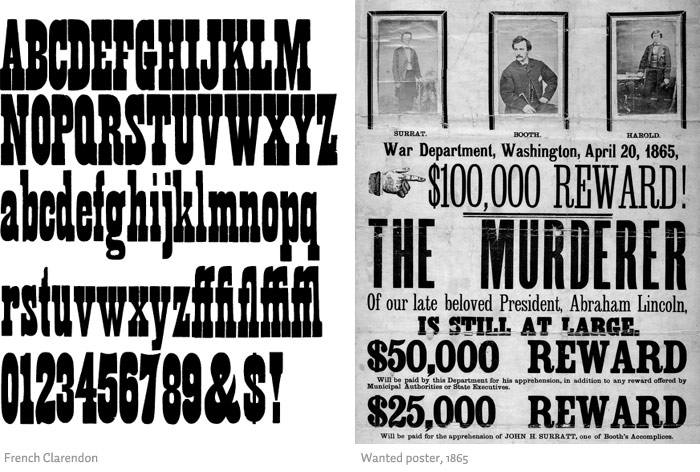
"The font was used extensively by the government of the German Empire for proclamations during World War I, and was also common in wanted posters of the American Old West. Craw Clarendon Bold was used by the United States National Park Service on traffic signs, but has been replaced by NPS Rawlinson Roadway. In 2008, the typeface was utilized extensively by the Ruby Tuesday restaurant chain in the re-launch of their corporate identity. Via, the travel magazine of the American Automobile Association, uses the typeface for its logo and headline copy." (Source #2)

Picture found here.
Where You Can Get It: You can purchase it at these locations for varying prices: Adobe, LinoType, FontShop, and MyFonts.

Descriptive Terms for It: Display, large blocks of text, old, poster design, serif, Slab Serif, Victorian, and whole family.

Sources:
- #1 - http://www.webdesignerdepot.com/2011/08/the-most-popular-fonts-used-by-designers/
- #2 - http://en.wikipedia.org/wiki/Clarendon_(typeface)
- #3 - http://www.myfonts.com/fonts/bitstream/clarendon/
- #4 - The Complete Typographer: A Manual for Designing with Type" by Will Hill, 2nd Edition, p. 102
- #5 - The Complete Typographer: A Manual for Designing with Type" by Will Hill, 2nd Edition, p. 104

Examples:
Picture found here.
Picture found here.
Picture found here.
Picture found here.

Monday, December 31, 2012

Typeface Review: "Crescendo"

What It Looks Like:
Picture available here.
Its History: "Designed by Patrick Griffin and Nancy Harris Rouemy in 2011 and published by Canada Type." (Source #1)

"Canada Type is an independent font development studio based in Toronto. The studio was founded in 2004 by Rebecca Alaccari and Patrick Griffin, as a means to perform professional type solutions to creative indviduals and departments all over the world." (Source #2)

What Type of Font It Is: Ornamental - "the form of the letter itself is determined by some decorative or figurative intention. The Ornamental form may thus be composed of foliage, rustic woodwork, the human form, or abstract elements. The majority of Ornamental faces from the 19th century are capital only, and necessarily designed for use at larger sizes." (Source #3)


Picture available here.
How You Can Design With It: Meant mainly to be used as a display text. Best used in logos, posters, book covers, large containers, etc. "Decorative and Ornamental letters are, by definition, display faces and seldom, if ever, suited to the setting of any more than a small number of words." (Source #3)

Where You Can Get It: Available for purchase here: http://www.fontshop.com/search/?q=Crescendo.

Descriptive Terms For It: 1920s, art deco, art nouveau, book covers, decorative, display, flapper, poster, poster design, posters, logo, logo design, logos, and ornamental.

Sources:
-#1 - http://www.fontshop.com/fonts/downloads/canada_type/crescendo_ot/
-#2 - http://www.fontshop.com/fonts/foundry/canada_type/
-#3 - "The Complete Typographer: A Manual for Designing with Type" by Will Hill, 2nd Edition, p. 160

Examples:
Picture available here.