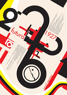
What It Looks Like:
 |
| Picture found here. |
"Futura was designed by Paul Renner [in about 1924-1926 and was issued by the Bauer Foundry in 1927]. While he wasn’t associated with the Bauhaus, he shared the idea that a modern typeface should express modern models, rather than simply reviving an older design." (Source #1 and #2)
 |
| Picture found here. |
"Futura has an efficient, forward appearance, and is derived from simple geometric forms. This is evident in the obvious influence of near-perfect circles, squares, and triangles. All non-essential elements were removed from the typeface, and the uppercase characters have proportions similar to classical Roman capitals." (Source #1)
How You Can Design With It: "Futura is an excellent choice for advertising copy. It was used by IKEA until 2010, Volkswagen, Shell Petrol, and HP in their advertising and branding. Wes Anderson uses Futura for all of his films, and it was also Stanley Kubrick’s favorite font. It’s well suited to any modern design, for both headings and short copy." (Source #1)
Where You Can Get It: You can get it for free here:
http://www.linotype.com/472/futura-family.html.
Descriptive Terms For It: book copy, classic, Geometric, sans serif, variety, whole family.
Sources:
- #1 - http://www.webdesignerdepot.com/2011/08/the-most-popular-fonts-used-by-designers/


No comments:
Post a Comment