Showing posts with label elegant. Show all posts

Sunday, April 7, 2013

Typeface Review: "Warnock"

What It Looks Like:
Picture found here.
Picture found here.
It's History: Designed by Robert Slimbach and published in 2000 by Adobe. As part of the Adobe Originals type composition family, it was named after John Warnock, "the co-founder of Adobe Systems, whose visionary spirit has led to major advances in desktop publishing and graphic arts software.

"A full-featured, state-of-the-art OpenType family - with Latin, Cyrillic, and Greek character sets in a variety of weights and optical size ranges-Warnock Pro is a classic yet contemporary composition family that performs a wide variety of typographic tasks with elegance." (Source #1)
Picture found here.
What Type of Font It Is: Transitional; "Characterized by triangulated serifs and a lively angularity, Warnock is a Transitional with a suggestion of calligraphic form, particularly in the swash letters that form part of a very extended type family." (Source #2)

How You Can Design With It: "Transitionals are, as a general rule, well suited to the setting of large bodies of text, as well as revealing considerable elegance of individual form when used for display purposes.... The italic fonts of Transitional typefaces were designed as an integral part of the face rather than as independent faces, and as a consequence reveal far greater affinity of form with the roman letters, while varying quite widely in style. They are better suited to use for emphasis or differentiation within roman text than the italics of Garalde or Humanist faces." (Source #3)
Picture found here.
Where You Can Get It: You can purchase the font at Fonts.com, MyFonts, Linotype, Typedia, Veer, FontShop, and Adobe Systems Inc.  FontPalace has a free download of Warnock Pro-Bold available.

Descriptive Terms for It: Classic, display, elegant, large blocks of text, large bodies of text, serif, Transitional, and whole family.

Extra: There's even an open letter, penned by Andrei Michael Herasimchuk of Design By Fire, to JohnWarnock to make his namesake a part of the public domain, as well as other typefaces such as Adobe Caslon Pro, Adobe Jenson Pro, Franklin Gothic, Frutiger, Futura, Gill Sans, Helvetica Neue, and Univers.

Sources:
- #1 - http://www.myfonts.com/fonts/adobe/warnock/
- #2 - "The Complete Typographer: A Manual for Designing with Type" by Will Hill, 2nd Edition, p. 91
- #3 - "The Complete Typographer: A Manual for Designing with Type" by Will Hill, 2nd Edition, p. 84

Examples:
Picture found here.
Picture found here.
Picture found here.

Monday, February 4, 2013

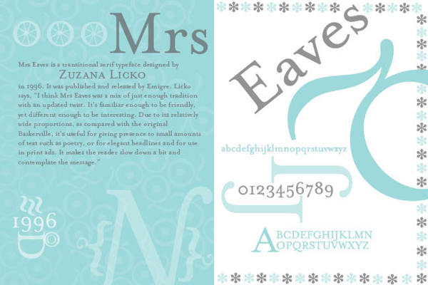
Typeface Review: "Mrs Eaves"

What It Looks Like:
Picture found here.
It's History: Created in 1996 by Zuzana Licko and licensed by Emigre Graphics, "a digital type foundry, publisher and distributor of graphic design centered information based in Berkeley, California, that was founded in 1984 by husband-and-wife team Rudy VanderLans and Zuzana Licko. The type foundry also published Emigre magazine between 1984 and 2005. Note that unlike the word émigré, Emigre is officially spelled without accents." (Source #1)

"Mrs Eaves is named after Sarah Eaves, the woman who became John Baskerville's wife. As Baskerville was setting up his printing and type business, Mrs. Eaves moved in with him as a live-in housekeeper, eventually becoming his wife after the death of her first husband, Mr. Eaves. Mrs Eaves is a revival of the types of English printer and punchcutter John Baskerville, and is related to contemporary Baskerville typefaces.

"Licko's selection of the name Mrs Eaves reveals an interesting story. Like his types, John Baskerville was, himself, a controversial character. He hired Sarah Eaves as his housekeeper. Eventually her husband Richard abandoned her and their five children, and Mrs Eaves became Baskerville's mistress and eventual helpmate with typesetting and printing. She married Baskerville within a month of her estranged husband's death. Selection of the name Mrs Eaves honors one of the forgotten women in the history of typography." (Source #2)
Picture found here.
What Type of Font It Is: Transitional: "Transitionals are, as a general rule, well suited to the setting of large bodies of text, as well as revealing considerable elegance of individual form when used for display purposes.... The italic fonts of Transitional typefaces were designed as an integral part of the face rather than as independent faces, and as a consequence reveal far greater affinity of form with the roman letters, while varying quite widely in style. They are better suited to use for emphasis or differentiation within roman text than the italics of Garalde or Humanist faces." (Source #3)

How You Can Design With It: Both elegant and with 213 ligatures, it is perfect for those who want classic style for their book or magazine.

"The typeface family includes roman, italic, petite capitals, small capitals, bold, and roman and italic ligatures. Ligatures in all variants of Mrs Eaves include the standard fi, ffi, andfl ligatures, and resurrect the classic eighteenth century ct and st ligatures. A Just Ligatures variant, available in roman and italic, contain a vast array of new ligatures, many incorporating intertwined and swash characters.

"The Mrs Eaves Ligatures sets include 213 ligatures, ranging from the common to the fanciful. The OpenType format fonts contain all 213 ligatures.

"The WordPress logotype is set in Mrs Eaves. It is also used for the titles (but not author names) on the covers and spines of the current Penguin Classics from Penguin Books. Blacktree's Quicksilver wordmark uses Mrs Eaves. Roman and petite caps. Bowdoin College uses Mrs Eaves in the college wordmark and in many other official materials. Radiohead's 2003 album Hail to the Thief prominently used Mrs Eaves in its related artworks." (Source #2)

Where You Can Get It: You may purchase various versions of Mrs Eaves via Emigre's website, located here: http://www.emigre.com/EF.php?fid=109.
Picture found here.

Descriptive Terms For It: book copy, classical, elegant, large bodies of text, legible, ligatures, pretty, serif, Transitional, versatile, variety, and whole family.

Sources:
- #1 - http://en.wikipedia.org/wiki/Emigre
- #2 - http://en.wikipedia.org/wiki/Mrs_Eaves
- #3 - "The Complete Typographer: A Manual for Designing with Type" by Will Hill, 2nd Edition, p. 84


Examples:
Picture found here.
Picture found here.
Picture found here.
Picture found here.
Picture found here.
Picture found here.
Picture found here.
Picture found here.

Thursday, December 27, 2012

Typeface Review: "Harrington"

What It Looks Like:
Picture available here.
Its History: It is incredibly hard to find anything concrete about this beautiful typeface. I found this on another blog: "It was created in 1991 by Sam Wang, an unknown typesetter." (Source #1)

And although this next paragraph claims it was created by The Font Bureau, Inc. there is no acknowledgment of this typeface anywhere on that company's website. "Harrington is a decorative serif with ornamental flourishes. Harrington has playful flourishes in the letterforms that give it an elegant, distinctive appearance. Harrington contains 248 glyphs and was created by The Font Bureau, Inc." (Source #2)


Picture available here.
What Type of Font It Is: Decorated - "As a general but not universal rule, a Decorated face is based upon a recognizable face within which decorative characteristics have been added, whereas in an Ornamental face, the form of the letter itself is determined by some decorative or figurative intention." (Source #3)

How You Can Design With It: "Decorative and Ornamental letters are, by definition, display faces and seldom, if ever, suited to the setting of any more than a small number of words. An informed choice of text face to accompany these will take into account the conventions of text setting in the period from which the display face originates, in order to ensure compatibility." (Source #3)

Where You Can Get It: "A TrueType version of this font is provided free with the Microsoft Office Value Pack (Macintosh)." (Source #4) 
Available for purchase at these sites:

Descriptive Terms For It: decorated, display, elegant, feminine, headings, legibility, logo, and sub-headings.

Sources:
-#1 - http://helz-design.com/2012/03/font-of-the-week-12-harrington/,
-#2 - http://www.ascenderfonts.com/font/harrington.aspx,
-#3 - "The Complete Typographer: A Manual for Designing with Type" by Will Hill, 2nd Edition, p. 160, and
-#4 - http://www.identifont.com/show?1ND.

Examples:
Technically, this is a different typeface, "Baroque",
but it is reminiscent of "Harrington".
Picture available here.
Design copyright 2010 by Kara Muller.
Picture available here.
Design copyright 2011 by Kara Muller.
Picture available here.

Monday, December 17, 2012

Typeface Review: "Bickham Script Pro"

What It Looks Like:
Picture can be found here.
Its History: "Bickham Script Pro is a script typeface based on English round hand writing common in the 18th century, and specifically on the engravings of George Bickham. It’s an ornate, romantic typeface, available in regular, bold, and semibold weights. Bickham Script Pro was created by Richard Lipton in 1997, and is available as part of the Adobe Type Library." (Source #1)

"Richard Lipton grew up in New York City and studied art and design upstate at Harpur College where he was introduced to the magic of calligraphy. He continued his lettering journey in 1974 as a freelance calligrapher, signpainter, and graphic designer and eventually established a calligraphy studio in Cambridge, Massachusetts. In 1983, Lipton began working for Bitstream, a digital type foundry and helped to make Bitstream’s type library one of the most respected in the industry. In his tenure as senior designer, Lipton developed two original type families: Arrus, and Cataneo (with Jacqueline Sakwa). In 1991, Lipton created an independent type and calligraphy studio and designed many original typefaces including BickhamPro for Adobe and Sloop for Font Bureau. Currently he is a full time type designer at Font Bureau where he develops custom fonts for international clients." (Source #2)

Picture can be found here.
What Type of Font It Is: Script, Italic, and Chancery - "The function of Script typefaces is primarily as a contrast to roman type and few are suitable for the setting of extended passages of running text. The more formal Chancery, or roundhand, faces can be used for introductory paragraphs, while the more expressive and gestural calligraphic Scripts should normally be used for display purposes only." (Source #3)

How You Can Design With It: "Bickham Script Pro is excellent for formal, elegant designs, especially those reminiscent of its origin in the 18th century. It also includes a number of OpenType features, including discretionary ligatures, swashes, superscripts, stylistic alternates, and cast-sensitive glyph connectors. The contextual changes that occur to the characters as one types make it an especially versatile typeface, and improves your designs effortlessly.

"Bickham Script Pro is purely a display typeface, perfect for headings and subheads. It’s commonly seen in logos, menus, invitations, annual reports, and packaging, in primarily formal, elegant designs." (Source #1)

"As one types, substitutions are made dynamically as the context changes. Not only do varied ligatures appear, but subtle changes to glyph exit and entry strokes ensure an attractive, flowing text both between letters and at word beginnings and endings." (Source #4)

Where You Can Get It: Bickham Script Pro is available for purchase here: http://store1.adobe.com/cfusion/store/html/index.cfm?store=OLS-US&event=displayFontPackage&code=1736.

Descriptive Terms For It: classical, display, elegant, formal, headings, logo, script, serif, and sub-headings.

Sources:
-#1 - http://www.webdesignerdepot.com/2011/08/the-most-popular-fonts-used-by-designers/,
-#2 - http://www.fontbureau.com/people/RichardLipton/,
-#3 - "The Complete Typographer: A Manual for Designing with Type" by Will Hill, 2nd Edition, p. 150,
-#4 - http://www.adobe.com/type/browser/landing/bickham.html.

Examples:

Picture can be found here.
2012 copyright HitRECord.org.
Picture can be found here.