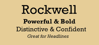
What It Looks Like:
 |
| Picture found here. |
What Type of Font It Is: Slab Serif; "At their best, Slab Serifs are both robust and colorful, with the serifs providing a strong continuity of line. The historic Slab Serifs are generally most effective in the heavier weights.... the substantial serifs and consistent stroke widths retain their form when printed upon rough or absorbent papers or at low digital resolutions. They also survive reversal better than any other serif form, and are excellent for display and semi-display contexts. They were widely used in publishing, packaging, and art/editorial design in the late 1950s and early 1960s." (Source #2)
"Rockwell is a largely geometric face with a well-defined slab serif and is available in four weights. Rockwell has a fairly high x-height and noticeably short descenders. The italic is a somewhat undeveloped oblique form of the roman." (Source #3)
 |
| Picture found here. |
"Rockwell is best-suited for use as a display typeface due to its thick, monoweighted strokes." (Source #1)
Where You Can Get It: You can buy it at Fonts.com, or you can purchase all the complete pack from Monotype Design Studio.
Descriptive Terms for It: Display, headlines, poster design, Slab serif, and serif.
Bonus: Here is a very well constructed video describing "Rockwell". Enjoy!
Sources:
- #1 - http://www.webdesignerdepot.com/2011/08/the-most-popular-fonts-used-by-designers/
- #2 - The Complete Typographer: A Manual for Designing with Type" by Will Hill, 2nd Edition, p. 102
- #3 - The Complete Typographer: A Manual for Designing with Type" by Will Hill, 2nd Edition, p. 105


No comments:
Post a Comment