Showing posts with label Graphic Designer of the Month. Show all posts

Saturday, March 2, 2013

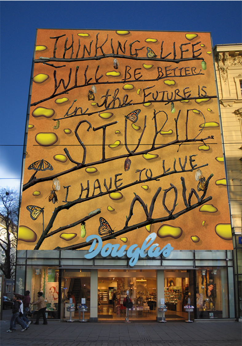
Graphic Designer of the Month: Stefan Sagmeister

Picture found here.
A Short Biography: Stefan Sagmeister, born 1962 in Bregenz, Austria, is a New York-based graphic designer and typographer. He has his own design firm—Sagmeister & Walsh Inc.—in New York City. He has designed album covers for Lou Reed, OK Go, The Rolling Stones, David Byrne, Aerosmith and Pat Metheny.

"Things I Have Learned"
book cover.
Picture found here.
Sagmeister studied graphic design at the University of Applied Arts Vienna. He later received a Fulbright scholarship to study at the Pratt Institute in New York. He began his design career at the age of 15 at Alphorn, an Austrian Youth magazine, which is named after the traditional Alpine musical instrument.

In 1991, he moved to Hong Kong to work with Leo Burnett's Hong Kong Design Group. In 1993, he returned to New York to work with Tibor Kalman's M&Co design company. His tenure there was short lived, as Kalman soon decided to retire from the design business to edit 
Colors magazine for the Benetton Group in Rome.

The Rolling Stones
Bridge to Babylon.
Picture found here.
Stefan Sagmeister proceeded to form the New York based Sagmeister Inc. in 1993 and has since designed branding, graphics, and packaging for clients as diverse as the Rolling Stones, HBO, the Guggenheim Museum and Time Warner. Sagmeister Inc. has employed designers including Martin Woodtli, and Hjalti Karlsson and Jan Wilker, who later formed Karlssonwilker.

Stefan Sagmeister is a long-standing artistic collaborator with musicians David Byrne and Lou Reed. He is the author of the design monograph "Made You Look" which was published by Booth-Clibborn editions.

Once in a Lifetime box set.
Picture found here.
Solo shows on Sagmeister, Inc.'s work have been mounted in Zurich, Vienna, New York, Berlin, Japan, Osaka, Prague, Cologne, and Seoul. He teaches in the graduate department of the School of Visual Arts in New York and has been appointed as the Frank Stanton Chair at the Cooper Union School of Art, New York.

His motto is "Design that needed guts from the creator and still carries the ghost of these guts in the final execution."

Sagmeister goes on a year-long sabbatical around every seven years, where he does not take work from clients.

Everything That Happens Will
Happen Today
 album.
Picture found here.
What Is His Specialty: His best known work is probably that of his fantastical album covers for various bands, such as the Once in a Lifetime box set by Talking Heads, for which he received a Grammy Award for "Best Boxed or Special Limited Edition Package" category in 2005. He received a second Grammy Award for his design of the David Byrne and Brian Eno album Everything That Happens Will Happen Today in the Grammy Award for "Best Recording Package" category on January 31, 2010. His album cover for the Rolling Stones record Bridges to Babylon is probably his most featured in books and magazine articles about Graphic Design.

AIGA poster.
Picture found here.
His most famous poster can be argued between his Lou Reed's "Set the Twilight Reeling" promotional poster for the album of the same name, or his AIGA poster featuring typography etched into his skin - his assistant used an E-xacto knife. Now that's passion for your work.

Lou Reed poster.
Picture found here.
About His Work & Influences: In response to an interviewer's question about who influences his work: "Tibor Kalman was the single most influential person in my designy life and my one and only design hero. 15 years ago, as a student in NYC, I called him every week for half a year and I got to know the M&Co receptionist really well. When he finally agreed to see me it turned out I had a sketch in my portfolio rather similar in concept and execution then an idea M&Co was just working on: He rushed to show me the prototype out of fear I’d say later he stole it out of my portfolio. I was so flattered. When I finally started working there 5 years later I discovered it was, more than anything else, his incredible salesmanship that set his studio apart from all the others. There were probably a number of people around who were as smart as Tibor (and there were certainly a lot who were better at designing), but nobody else could sell these concepts without any changes, get those ideas with almost no alterations out into the hands of the public. Nobody else was as passionate. As a boss he had no qualms about upsetting his clients or his employees (I remember his reaction to a logo I had worked on for weeks and was very proud of: “Stefan, this is TERRIBLE, just terrible, I am so disappointed”). His big heart was shining through nevertheless. He had the guts to risk everything, I witnessed a very large architecture project where he and M&Co had collaborated with a famous architect and had spent a years worth of work: He was willing to walk away on the question of who will present to the client. Tibor had an uncanny knack for giving advice, for dispersing morsels of wisdom, packaged in rough language later known as Tiborisms: “The most difficult thing when running a design company is not to grow” he told me when I opened my own little studio. “Just don’t go and spend the money they pay you or you are going to be the whore of the ad agencies for the rest of your life” was his parting sentence when I moved to Hong Kong to open up a design studio for Leo Burnett.
Douglas Gordon's
The Vanity of Allegory.
Picture found here.
These insights were also the reason why M&Co. got so much press, journalists could just call him and he would supply the entire structure for a story and some fantastic quotes to boot. He was always happy and ready to jump from one field to another, corporate design, products, city planning, music video, documentary movies, children books, magazine editing were all treated under the mantra “you should do everything twice, the first time you don’t know what you’re doing, the second time you do, the third time its boring”. He did good work containing good ideas for good people."

Picture found here.
In response to "Who is your personal hero?" he had this to say: "As mentioned, Tibor Kalman, because he had the most guts of any designer I know and understood that spending energy on making sure that a design appears as designed is as important as designing it. Makoto Saito for selling the same photo shoot to different clients. Rick Valincenti for continuously doing ground breaking work. Paula Scher for designing the best project of her career (the type for the New Jersey Performing Art Center), after a 30 year career, last year."

When asked "What advice would you give up-and-coming graphic designers?", he said, "Don't take any advice from tried-and-true graphic designers."

Picture found here.
Where He Can Be Found: Mr. Sagmeister has a website with his design company, Sagmeister & Walsh, where he and his partner, Jessica Walsh, along with some associates, create "identities, commercials, websites, apps, films, books and objects for clients, audiences and ourselves." The website is located here: http://www.sagmeisterwalsh.com/. He also has a Facebook page which you can find here.

Current & Future Projects: Currently, Mr. Sagmeister teaches workshops at the School of Visual Arts while running his design business, Sagmeister & Walsh.

Effect on Graphic Design:

"Sagmeister's CD package designs are what poetry is to prose: distilled, intense, cunning, evocative and utterly complete. His intentions have set a new standard." - I.D. Magazine

Stefan Sagmeister is no mere commercial gun for hire. Sure, he's created eye-catching graphics for clients including the Rolling Stones and Lou Reed, but he pours his heart and soul into every piece of work. His design work is at once timeless and of the moment, and hispainstaking attention to the smallest details creates work that offers something new every time you look at it.

While a sense of humor invariably surfaces in his designs, Sagmeister is nonetheless very serious about his work; his intimate approach and sincere thoughtfulness elevate his design. A genuine maverick, Sagmeister achieved notoriety in the 1990s as the designer who self-harmed in the name of craft: He created a poster advertising a speaking engagement by carving the salient details onto his torso.
Picture found here.
Bibliography:
- Sagmeister, Stefan, et al. Things I Have Learned In My Life So Far. Harry H. Abrams, 2008.

- Sagmeister, Stefan and Peter Hall. Made You Look. Abrams, 2009.

- Sagmeister, Stefan. Another Book About Sales & Promotional Material. Schmidt, 2011.

Sources:
- #1 - http://en.wikipedia.org/wiki/Stefan_Sagmeister
- #2 - http://www.goodreads.com/author/show/240651.Stefan_Sagmeister
- #3 - http://knstrct.com/2011/10/03/an-insightful-interview-with-stefan-sagmeister/
- #4 - http://www.ted.com/speakers/stefan_sagmeister.html

Stefan Sagmeister on the 7 Rules of Making More Happiness:

Friday, February 1, 2013

Graphic Designer of the Month: Paul Rand

Picture found here.
Book cover design
by Paul Rand.
Picture found here.
A Short Biography: The man who made corporate America cool was born named Peretz Rosenbaum (Source #1) on August 15th, 1914 in Brooklyn, New York. "He embraced design at a very young age, painting signs for his father's grocery store as well as for school events at P.S. 109. Rand's father did not believe art could provide his son with a sufficient livelihood, and so he required Paul to attend Manhattan's Harren High School while taking night classes at the Pratt Institute, Rand was largely "self-taught as a designer, learning about the works of Cassandre (pseudonym of Adolphe Jean-Marie Mouron) and László Moholy-Nagy from European magazines such as Gebrauchsgraphik.


Book covers designed
by Paul Rand.
Picture found here.
"Rand was educated at the Pratt Institute (1929–1932), Parsons The New School for Design (1932–33), and the Art Students League(1933–1934). From 1956 to 1969, and beginning again in 1974, Rand taught design at Yale University in New Haven, Connecticut. Rand was inducted into the New York Art Directors Club Hall of Fame in 1972.

"Rand devoted his final years to design work and the writing of his memoirs. In 1996, he died of cancer at age 82 (November 26th, 1996) in Norwalk, Connecticut. He is buried in Beth El Cemetery." (Source #2)

Logos designed by Paul Rand. Picture found here.
What Was His Specialty:
"The International Typographic Style, also known as the Swiss Style, is a graphic design style developed in Switzerland in the 1950s that emphasizes cleanliness, readability and objectivity. Hallmarks of the style are asymmetric layouts, use of a grid, sans-serif typefaces like Akzidenz Grotesk, and flush left, ragged right text. The style is also associated with a preference for photography in place of illustrations or drawings. Many of the early International Typographic Style works featured typography as a primary design element in addition to its use in text, and it is for this that the style is named.

Book cover design
by Paul Rand.
Picture found here.
"Other designers who use this Max Bill, Adrian Frutiger, Armin Hofmann, Richard Paul Lohse, Josef Müller-Brockmann, Emil Ruder, and Jan Tschichold." (Source #3)

About His Work & Influences: "Though Rand was a recluse in his creative process, doing the vast majority of the design load despite having a large staff at varying points in his career, he was very interested in producing books of theory to illuminate his philosophies. László Moholy-Nagy may have incited Rand's zeal for knowledge when he asked his colleague if he read art criticism at their first meeting. Rand said no, prompting Moholy-Nagy to reply "Pity." Steven Heller ( wrote "Thoughts on Rand" for Print magazine in May–June 1997 edition) elaborates on this meeting's impact, noting that, "from that moment on, Rand devoured books by the leading philosophers on art, including Roger Fry, Alfred North Whitehead, and John Dewey." These theoreticians would have a lasting impression on Rand's work; in a 1995 interview with Michael Kroeger discussing, among other topics, the importance of Dewey's Art as Experience, Rand elaborates on Dewey's appeal:


Book cover design
by Paul Rand.
Picture found here.
'[. . . Art as Experience] deals with everything — there is no subject 
he does not deal with. That is why it will take you one hundred years 
to read this book. Even today's philosophers talk about it[.] 
[E]very time you open this book you find good things. 
I mean the philosophers say this, not just me. You read this, 
then when you open this up next year, that you read something new.'

"Dewey is an important source for Rand's underlying sentiment in graphic design; on page one of Rand's groundbreaking Thoughts on Design, the author begins drawing lines from Dewey's philosophy to the need for "functional-aesthetic perfection" in modern art. Among the ideas Rand pushed in Thoughts on Design was the practice of creating graphic works capable of retaining recognizable quality even after being blurred or mutilated, a test Rand routinely performed on his corporate identities." (Source #2)

A set of children's books
designed by Paul Rand.
Picture found here.
Where He Can Be Found: Though this great designer is dead, his website is located here at http://www.paul-rand.com/, with a simple aesthetic I think he would be most proud of.

Effect On Graphic Design: "Rand's most widely known contributions to design are his corporate identities, many of which are still in use. IBM, ABC, Cummins Engine, UPS, and the now-infamous Enron, among many others, owe Rand their graphical heritage. One of his strengths, as Moholy-Nagy pointed out, was his ability as a salesman to explain the needs his identities would address for the corporation. According to graphic designer Louis Danziger:


'He almost singlehandedly convinced business that design 
was an effective tool. [. . .] Anyone designing in the 1950s and 1960s 
owed much to Rand, who largely made it possible 
for us to work. He more than anyone else made the profession 
reputable. We went from being commercial artists to being 
graphic designers largely on his merits.'

Book cover design
by Paul Rand.
Picture found here.
"Although his logos may be interpreted as simplistic, Rand was quick to point out in A Designer's Art that 'ideas do not need to be esoteric to be original or exciting.' His American Broadcasting Company trademark, created in 1961, then used by ABC-TV in the fall of 1962, epitomizes that ideal of minimalism while proving Rand's point that a logo 'cannot survive unless it is designed with the utmost simplicity and restraint.' Rand remained vital as he aged, continuing to produce important corporate identities into the eighties and nineties with a rumored $100,000 price per single solution. The most notable of his later works was his collaboration with Steve Jobs for the NeXT Computer corporate identity; Rand's simple black box breaks the company name into two lines, producing a visual harmony that endeared the logogram to Jobs. Steve Jobs was pleased: just prior to Rand's death in 1996, his former client labeled him, simply, 'the greatest living graphic designer.' " (Source #2)

Paul Rand's book
Thoughts On Design.
Picture found here.
Bibliography: 
  • Rand, Paul (1970). Thoughts On Design. Studio Vista Van Nostrand Reinhold. ISBN 978-0289798362.
  • Rand, Paul (1985). Paul Rand: A Designer's Art. New Haven: Yale University Press. ISBN 978-0300082821.
  • Rand, Paul (1994). Design, Form, and Chaos. New Haven: Yale University Press. ISBN 978-0300055535.
  • Rand, Paul (1996). From Lascaux to Brooklyn. New Haven: Yale University Press. ISBN 978-0300066760.


Sources:
- #1 - http://www.kettererkunst.com/bio/paul-rand-1914.shtml
- #2 - http://en.wikipedia.org/wiki/Paul_Rand
- #3 - http://en.wikipedia.org/wiki/International_Typographic_Style

Also, this video, which I first saw here: 

Tuesday, January 1, 2013

Graphic Designer of the Month: Luba Lukova

The great Luba Lukova.
A Short Biography: She has a Masters Degree in Fine Arts from the National Academy of Fine Arts, located in Sofia, Bulgaria.

"Internationally recognized, New York based, Luba Lukova is one of the most distinctive image-makers working today. Whether by using an economy of line, color, and text to pinpoint essential themes of the human condition or to succinctly illustrate social commentary, her work is undeniably powerful and thought provoking.

"Lukova has won many awards including Grand Prix Savignac at the International Poster Salon, Paris, France; the Golden Pencil Award at the One Club, New York; ICOGRADA Excellence Award at the Poster Festival in Chaumont, France; and Honor Laureate at the International Poster Exhibition in Fort Collins, CO. Solo exhibitions of her work have been held at UNESCO, Paris; DDDGallery, Osaka, Japan; La MaMa, New York and The Art Institute of Boston. She is widely regarded for her editorial illustrations for The New York Times and has received commissions for her work from the Wall Street Journal, Time magazine, Adobe Systems, Sony Music, and Harvard University. Her evocative theatre posters have graced numerous stage productions in the US and Europe. Lukova’s work is included in the permanent collections of the Museum of Modern Art, New York; The Library of Congress, Washington, DC; Bibliotheque Nationale de France. Most recently her Health Coverage poster was in a prestigious exhibition during the Inauguration of President Obama in Washington, DC. In 2009 publisher Clay & Gold will release “Speaking with Images”, a new book about her work." (Source #1)

What Is Her Specialty: "Regarded as one of the most distinctive image-makers working today, Luba’s artwork uses metaphors, the juxtaposition of symbols, and bold, deceptively simple graphics to comment on many of today’s social and political issues.

"'I was born and educated in Bulgaria and, of course, this has shaped me both as a person and an artist. I came to the U.S. by invitation of the International Poster Exhibition in Fort Collins, Colorado. They had seen my work at other international biennials and wanted me to be a part of their show. So I’ve lived in New York more than any other place in the world, and that has also had an intense effect on me and my work.'" (Source #2)

About Her Work & Influences: "My grandmother was an artist and I grew up around her, so from a very early childhood I was determined to become an artist like her. I drew a lot as a kid, like almost every child does. I’ve attended many art classes and I graduated from the National Art Academy in Sofia.

"This was a six-year program with a very vigorous training in drawing and painting. I graduated with a masters degree in poster and graphic design. But we were basically trained to do everything and that I think was a very good thing. I cannot say that there is a single influence in my career as an artist. I’m open to so many things. I’ve been definitely affected by artists like Picasso, Goya, Rembrandt, Chekhov, Shakespeare, Charlie Chaplin, and so many more.

"I think art should reflect what is going on in the real world. I’ve never wanted to be a distant, elitist artist and I’ve always felt that drive to tackle controversial issues. Toward the end of my studies at the National Art Academy, I had this thought that if I’ve spent so many years learning how to speak with my art, I should use that skill to say something meaningful and truthful, no matter the consequences. I guess this is a simple idea but it is relevant to me to this day.

[On whether art can affect change or be a catalyst for change:] "I do believe so. It is easy to get discouraged about art’s ability to change the world when we see that abuse and injustice continue despite the creation of so much powerful art. It is impossible for art to fix a declining economy or stop all wars, but art changes the way people see and understand reality. And if we, as artists, often lose faith in the impact of our work, those in power are quite aware of it. If art were so innocent and benign, there wouldn’t be censorship in this world.

"Sometimes I do many sketches, sometimes the process is very fast. I also paint with acrylic paint and occasionally will touch up finished images on the computer. But this is when I’m preparing files for print, the actual image making is entirely done by hand. I love doing research for every piece I create." (Source #2)


Where She Can Be Found: Currently teaching visual communication and graphic design courses as an Adjunct Assistant Professor at Pratt Institute, she also has a brand new website located here: http://www.lukova.net/. (Source #1)


Current & Future Projects? When speaking of her publishing company, Clay & Gold, which was established in 2007, to Michael Gibbs of Be Inkandescent Magazine, she had this to say:

"It is an extension of my artistic practice and it allows me to publish my work without any restrictions. The Social Justice series was our first publication. We are in the finishing stages of a new book called 'Graphic Guts,' a comprehensive collection of my political posters.

"The name Clay & Gold comes from an ancient Sanskrit text saying: “To the illumined mind, a clod of clay, a stone and gold are the same.” I thought this might be true for what I’d like to do with my publications. The beauty and meaning have nothing to do with the expense of the materials, it is the ideas and feelings that bring value. So that is why I called it 'Clay & Gold.'"

You can buy prints of Lukova's 'Social Justice' series at Clay & Gold, which can be found here: http://www.clayandgold.com/index.html.

Effect on Graphic Design: I can only speak from a personal standpoint, but I find Lukova's work truly inspiring. In a world where images are multi-layered and tinkered using computer software, Lukova's insistence on hand drawing, for both the illustrations and the typography used in her work, is refreshing. Her bold color choices and specific need to use minimalist images make her posters say the very thing she's trying to bring to the forefront of public consciousness.

I had a project in school where we had to take a public issue and create a series of posters using only three colors (not including white) and use a set of minimalist drawings to inform people about the issue or provoke people into action. This is the way Lukova designs. It is very difficult to come up with a politically charged image that won't represent both sides of the issue when transformed into a minimalist drawing. To make it a little more simple, the teachers allowed us to use a tagline in the piece.


Sources:
- #1 - http://www.pratt.edu/academics/art_and_design/ug_communications_design/faculty_