Showing posts with label sub-headings. Show all posts

Wednesday, April 3, 2013

Typeface Review: "Trajan"

What It Looks Like:
Picture found here.
It's History: "Trajan was designed by Carol Twombly in 1989 as a faithful transcription of the 1st-century AD letters on the Trajan column in Rome.

"Because of its origins, Trajan does not have a miniscule lowercase but has instead a small-cap lowercase, comprising capital forms of a slightly lower height. It has proved an extremely popular titling face, combining classical authority with great refinement of form." (Source #1)
Picture found here.
What Type of Font It Is: Glyphic; "This is a category of carved or inscribed type with its origins in both the history and the contemporary practice of letter cutting, and its main exponents have been equally distinguished in the letter crafts.

"Glyphics are primarily a titling form and many have no lowercase. Mantinia and Trajan exist only in capital form. Some of the Germanic Glyphics can be effectively used for limited amounts of text setting, providing a tonal depth similar to that of the heavier Humanist revival faces. Their weight can create a more dramatic color in a text page but their application in this context is fairly specialized." (Source #2)
Picture found here.
How You Can Design With It: "Trajan is available in regular and bold weights, and is suitable for a range of titling functions. It is also suitable for architectural and environmental use, particularly in contexts involving reference to classical concepts or values. If it is to be paired with a text face, this should be based upon similar classical proportions, and care should be taken to compliment the delicacy of the strokes and serifs." (Source #1)

Where You Can Get It: You can download the font at FontPalace or you can purchase the font at MyFonts.

Descriptive Terms for It: Classic, Glyphic, Greek, headings, no lowercase, old, Roman, serif, sub-headings, and titles.

Sources:
- #1 - The Complete Typographer: A Manual for Designing with Type" by Will Hill, 2nd Edition, p. 144
- #2 - The Complete Typographer: A Manual for Designing with Type" by Will Hill, 2nd Edition, p. 142

Examples:
Picture found here.
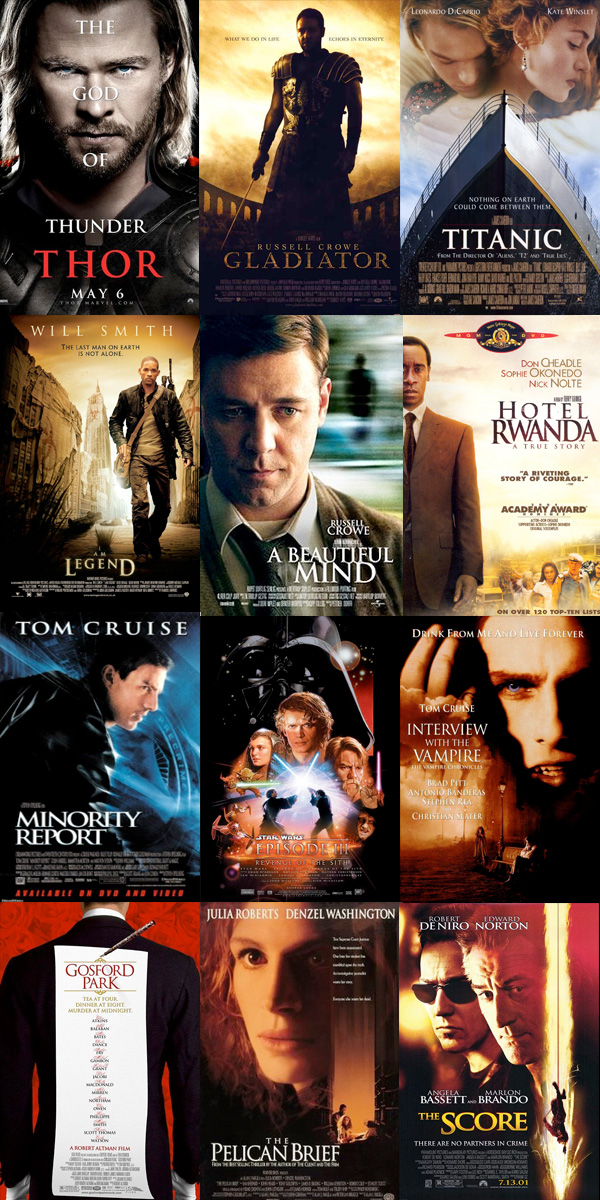
And every movie poster ever.
Picture found here.
Picture found here.
Picture found here.
Picture found here.

Tuesday, February 19, 2013

Typeface Review: "Avenir"

What It Looks Like:
Picture found here.
It's History: "Avenir is a geometric sans-serif typeface designed in 1988 by Adrian Frutiger. The name, Avenir, means “future” in French. It was designed to be a more humanistic version of traditional geometric typefaces like Futura. Upon release, it was available in three weights, using Frutiger’s two-digit weight and width naming convention: 45 (book) /46 (oblique), 55 (text) /56 (oblique), and 75 (bold) /76 (oblique). Three more weights were later added.

"Avenir is a relatively new typeface, but it’s become widely used. LG uses it for the buttons on most of their cell phones. BBC Two uses Avenir in its logo and identity. Dwell magazine started using it in 2007, and the upcoming J.J. Abrams film Super 8 also uses it for titles." (Source #1)

What Type of Font It Is: Geometric; "Geometric typefaces reflect the idea that type can be reduced to simple geometric units and cleansed of all historical associations. They are characteristic of the spirit of modernism that formed the dominant design ideology in Europe from the 1930s through the 1950s.

"Geometrics are, above all, the expression of an idea, and as such carry a set of associative values fitting them better for display and semi-display use." (Source #2)
Picture found here.
How You Can Design With It: "A balanced and restrained Geometric with a Humanist sensitivity in many of its letterforms, Avenir requires fairly loose letter spacing." (Source #2)

"Avenir’s greatest strengths are its simplicity and balance. It bridges the gap between geometric and humanist sans-serifs, making it a versatile, modern choice. Avenir is suitable for both headline and body copy. Improvements in hinting have made it better for on-screen viewing at smaller sizes." (Source #1)

Where You Can Get It: You can download a version for free using FontPalace, or you could buy a version of it from Fonts.com. There are also other versions that are like it and for free download:
Picture found here.
Descriptive Terms for It: Body copy, display, Geometric, headings, legible, modern, sans serif, simple, sub-headings, and versatile.

Sources:
- #1 - http://www.webdesignerdepot.com/2011/08/the-most-popular-fonts-used-by-designers/
- #2 - The Complete Typographer: A Manual for Designing with Type" by Will Hill, 2nd Edition, p. 134 and 141.
Examples:
Picture found here.


It isn't exactly like "Avenir", but it is like it and it is called "GatsbyFLF".
Picture found here.
Picture found here.

Thursday, December 27, 2012

Typeface Review: "Harrington"

What It Looks Like:
Picture available here.
Its History: It is incredibly hard to find anything concrete about this beautiful typeface. I found this on another blog: "It was created in 1991 by Sam Wang, an unknown typesetter." (Source #1)

And although this next paragraph claims it was created by The Font Bureau, Inc. there is no acknowledgment of this typeface anywhere on that company's website. "Harrington is a decorative serif with ornamental flourishes. Harrington has playful flourishes in the letterforms that give it an elegant, distinctive appearance. Harrington contains 248 glyphs and was created by The Font Bureau, Inc." (Source #2)


Picture available here.
What Type of Font It Is: Decorated - "As a general but not universal rule, a Decorated face is based upon a recognizable face within which decorative characteristics have been added, whereas in an Ornamental face, the form of the letter itself is determined by some decorative or figurative intention." (Source #3)

How You Can Design With It: "Decorative and Ornamental letters are, by definition, display faces and seldom, if ever, suited to the setting of any more than a small number of words. An informed choice of text face to accompany these will take into account the conventions of text setting in the period from which the display face originates, in order to ensure compatibility." (Source #3)

Where You Can Get It: "A TrueType version of this font is provided free with the Microsoft Office Value Pack (Macintosh)." (Source #4) 
Available for purchase at these sites:

Descriptive Terms For It: decorated, display, elegant, feminine, headings, legibility, logo, and sub-headings.

Sources:
-#1 - http://helz-design.com/2012/03/font-of-the-week-12-harrington/,
-#2 - http://www.ascenderfonts.com/font/harrington.aspx,
-#3 - "The Complete Typographer: A Manual for Designing with Type" by Will Hill, 2nd Edition, p. 160, and
-#4 - http://www.identifont.com/show?1ND.

Examples:
Technically, this is a different typeface, "Baroque",
but it is reminiscent of "Harrington".
Picture available here.
Design copyright 2010 by Kara Muller.
Picture available here.
Design copyright 2011 by Kara Muller.
Picture available here.

Monday, December 17, 2012

Typeface Review: "Bickham Script Pro"

What It Looks Like:
Picture can be found here.
Its History: "Bickham Script Pro is a script typeface based on English round hand writing common in the 18th century, and specifically on the engravings of George Bickham. It’s an ornate, romantic typeface, available in regular, bold, and semibold weights. Bickham Script Pro was created by Richard Lipton in 1997, and is available as part of the Adobe Type Library." (Source #1)

"Richard Lipton grew up in New York City and studied art and design upstate at Harpur College where he was introduced to the magic of calligraphy. He continued his lettering journey in 1974 as a freelance calligrapher, signpainter, and graphic designer and eventually established a calligraphy studio in Cambridge, Massachusetts. In 1983, Lipton began working for Bitstream, a digital type foundry and helped to make Bitstream’s type library one of the most respected in the industry. In his tenure as senior designer, Lipton developed two original type families: Arrus, and Cataneo (with Jacqueline Sakwa). In 1991, Lipton created an independent type and calligraphy studio and designed many original typefaces including BickhamPro for Adobe and Sloop for Font Bureau. Currently he is a full time type designer at Font Bureau where he develops custom fonts for international clients." (Source #2)

Picture can be found here.
What Type of Font It Is: Script, Italic, and Chancery - "The function of Script typefaces is primarily as a contrast to roman type and few are suitable for the setting of extended passages of running text. The more formal Chancery, or roundhand, faces can be used for introductory paragraphs, while the more expressive and gestural calligraphic Scripts should normally be used for display purposes only." (Source #3)

How You Can Design With It: "Bickham Script Pro is excellent for formal, elegant designs, especially those reminiscent of its origin in the 18th century. It also includes a number of OpenType features, including discretionary ligatures, swashes, superscripts, stylistic alternates, and cast-sensitive glyph connectors. The contextual changes that occur to the characters as one types make it an especially versatile typeface, and improves your designs effortlessly.

"Bickham Script Pro is purely a display typeface, perfect for headings and subheads. It’s commonly seen in logos, menus, invitations, annual reports, and packaging, in primarily formal, elegant designs." (Source #1)

"As one types, substitutions are made dynamically as the context changes. Not only do varied ligatures appear, but subtle changes to glyph exit and entry strokes ensure an attractive, flowing text both between letters and at word beginnings and endings." (Source #4)

Where You Can Get It: Bickham Script Pro is available for purchase here: http://store1.adobe.com/cfusion/store/html/index.cfm?store=OLS-US&event=displayFontPackage&code=1736.

Descriptive Terms For It: classical, display, elegant, formal, headings, logo, script, serif, and sub-headings.

Sources:
-#1 - http://www.webdesignerdepot.com/2011/08/the-most-popular-fonts-used-by-designers/,
-#2 - http://www.fontbureau.com/people/RichardLipton/,
-#3 - "The Complete Typographer: A Manual for Designing with Type" by Will Hill, 2nd Edition, p. 150,
-#4 - http://www.adobe.com/type/browser/landing/bickham.html.

Examples:

Picture can be found here.
2012 copyright HitRECord.org.
Picture can be found here.