
What It Looks Like:
 |
| Picture found here. |
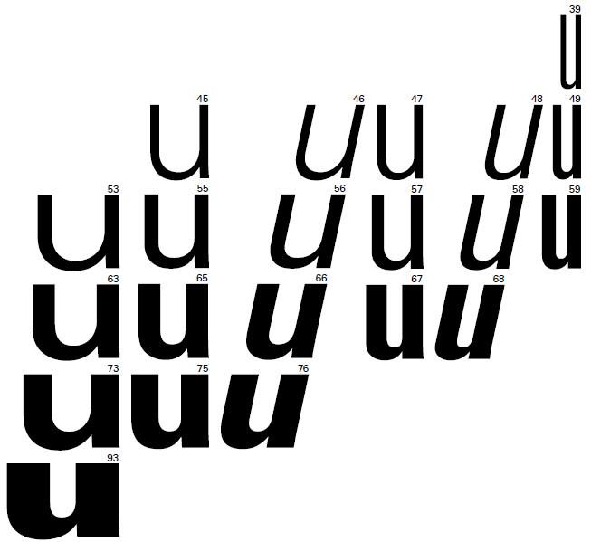
"Univers is based on the 1898 typeface Akzidenz-Grotesk, which was also the basis for Helvetica (the two typefaces are sometimes confused). The entire Univers type family consists of 44 faces, with 16 uniquely numbered weight, width, and position combinations. Twenty of these fonts offer oblique characters, while eight support Central European character sets and another eight support Cyrillic characters." (Source #1)
 |
| Picture found here. |
What Type of Font Is It: Neo-Grotesque; "Despite their origins as an expression of functionality and internationalism, 21st-century graphic design has seen increased use of Neo-Grotesques. Neo-Grotesques function better at small sizes than most other forms of sans serif, and they are consequently among the most suitable sans serif faces for long text setting. Their generous x-height and well-defined counters ensure page economy and legibility." (Source #2)
"The largest strength of Univers is its diversity, which is further enhanced by the number of weights available. It also has some of the same neutral character of Helvetica." (Source #1)
How You Can Design With It: "Univers is well-suited to a variety of designs, especially modern designs. It works well as both body copy and display." (Source #1)
"Univers is a durable face that can prove particularly useful when a wide range of differentiation is required. The condensed versions can be effectively used as text faces, allowing for setting to narrower columns than would normally be feasible." (Source #2)
Where You Can Get It: You can get it for free here:
http://www.linotype.com/search/univers#823a1cc7c532bf0877f557e08bf1b911.
Descriptive Terms For It: book copy, classic, Neo-Grotesque, sans serif, variety, whole family.
Where You Can Get It: You can get it for free here:
http://www.linotype.com/search/univers#823a1cc7c532bf0877f557e08bf1b911.
Descriptive Terms For It: book copy, classic, Neo-Grotesque, sans serif, variety, whole family.
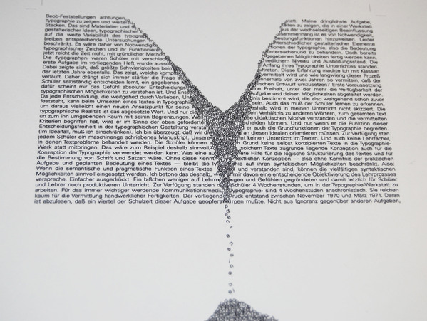
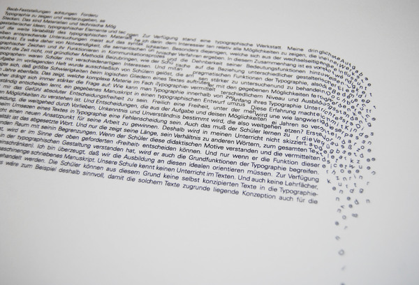
Extras: There was a typographic study of this illustrious font, which you can find here. It is actually quite beautiful in an architectural way. Here are two examples:
 |
| Picture found here. |
 |
| Picture found here. |
Sources:
- #1 - http://www.webdesignerdepot.com/2011/08/the-most-popular-fonts-used-by-designers/
- #2 - The Complete Typographer: A Manual for Designing with Type" by Will Hill, 2nd Edition, p. 126 and 129
- #1 - http://www.webdesignerdepot.com/2011/08/the-most-popular-fonts-used-by-designers/
- #2 - The Complete Typographer: A Manual for Designing with Type" by Will Hill, 2nd Edition, p. 126 and 129
Examples:
 |
| Picture found here. |


No comments:
Post a Comment