Showing posts with label Victorian. Show all posts

Thursday, December 1, 2022

Page Turning ASMR | Crinoline | No Talking

 You can watch new videos on my Youtube channel here!!!

New videos every Monday and Thursday!

Page Turning ASMR:


https://www.youtube.com/watch?v=R4lCPRNCueA&ab_channel=KarakreativeASMR

If you enjoy this please visit my channel 

and go like, subscribe, ring the bell icon, and comment!

Monday, November 7, 2022

Page Turning ASMR | Ravenclaw Junk Journal | No Talking

 You can watch new videos on my Youtube channel here!!!

New videos every Monday and Thursday!


Page Turning ASMR:


https://www.youtube.com/watch?v=35avcOVZox0&ab_channel=KarakreativeASMR

If you enjoy this please visit my channel 

and go like, subscribe, ring the bell icon, and comment!

Thursday, September 29, 2022

My Victorian Dollhouse Made From Scratch | Craft ASMR

 You can watch new videos on my Youtube channel here!!!

New videos every Monday and Thursday!

Dollhouse ASMR:


https://www.youtube.com/watch?v=VNL58mshR9s&ab_channel=KarakreativeASMR

If you enjoy this please visit my channel 

and go like, subscribe, ring the bell icon, and comment!

Monday, September 26, 2022

Strasburg Vacation & A Village Lost and Found Page Turning ASMR Videos!!!

 You can watch new videos on my Youtube channel here!!!

New videos every Monday and Thursday!

Page Turning ASMR:


https://www.youtube.com/watch?v=c90RxwmNBOo&ab_channel=KarakreativeASMR


Page Turning ASMR:


https://www.youtube.com/watch?v=fAP6Q25FRxA&ab_channel=KarakreativeASMR

If you enjoy this please visit my channel 

and go like, subscribe, ring the bell icon, and comment!

Monday, September 19, 2022

Steampunk Page Turning ASMR!!!

 You can watch new videos on my Youtube channel here!!!

New videos every Monday and Thursday!

Page Turning ASMR:


https://www.youtube.com/watch?v=Pavq_40ENhs&ab_channel=KarakreativeASMR

If you enjoy this please visit my channel 

and go like, subscribe, ring the bell icon, and comment!

Saturday, January 11, 2014

"The Life and Times of Queen Victoria" Book Review


The Life and Times of VictoriaThe Life and Times of Victoria by Dorothy Marshall
My rating: 4 of 5 stars

A biography of Queen Victoria, including pictures of the royal family.

I was using this book as an introduction to the icon that is Queen Victoria and it did that perfectly. There was a lot of information to cover what with her reign being so long and her being related to nearly everyone remotely royal. I still think she is an interesting character, but I feel like Prince Albert was the much more intriguing person.

He's in a foreign country with people who don't seem to respect him all that much throughout his whole career and life there. And still, he goes at the governing of this place with such gusto it makes me wonder if Queen Victoria did anything.

It seemed like she was just the signature on the paper. I mean, her childhood didn't allow her to learn how to do her job and know people, but still, she could have been active and learned about her countrymen. I liked how fond she was of the soldiers and awarded them all equally and in person. She seemed like a decent woman and wasn't a bad ruler. It's hard to really get her character with only a glimpse at her, so I will definitively read more about her.

The book itself was full of pictures of the monarch and her family. But they are of the usual variety, you have probably already seen them.

The only thing I had a problem with was how British it was. Every once in a while the author would mention something only a British, and at this point, an older British person, would know and that was sort of annoying. Usually, I really don't like it when the author inserts herself into the biography of someone I highly doubt she met at all in real life. But since this book was so short it didn't bother me too much.

Overall, a nice introduction to a monarch whose main contributions was having graced the world stage for so long, producing so many royal heirs, and a really big museum. But who knows, maybe with more reading I will change my opinion of her.


View all my reviews
I knight thee four out of five stars.

Friday, October 4, 2013

Bridal Shower Umbrella SOLD!!!

Image copyright 2013
by Kara Muller.
I had already purchased the umbrella from another seller at a craft show that I was attending. I had bought it because I thought it was pretty and I'm a sucker for fluffy stuff.

Image copyright 2013
by Kara Muller.
Anyway, it laid in my room for a few years before I found it again and realized it should have a second life with someone else. It already had some wonderful lace covering it (even on the inside), so I just wanted to perk it up some before selling it.

Image copyright
2013
by Kara Muller.
Image copyright 2013
by Kara Muller.
So I gave it a bit of a crafty face-lift:

* cleaned the handle,
* redecorated it with new flowers on the inside,
* added more of those same flowers to cover up the ugly metal prongs on the end,
* added a huge bow to cover up the metal tip at the top,
* used a tiny bit of bleach on some dark spots


Image copyright 2013
by Kara Muller.
Image copyright 2013
by Kara Muller.
And voila, beautiful once again!

I've called it a bridal shower umbrella, but it can also be used as a prop in a theatre production or what have you!

To buy it, go here to my Etsy store listing. To see more pictures of it, go here to my Facebook page photo album "Projects 2013". Be sure to 'like' my page while you're there and have a great day!

Tuesday, February 19, 2013

Typeface Review: "Clarendon"

What It Looks Like:
Picture found here.
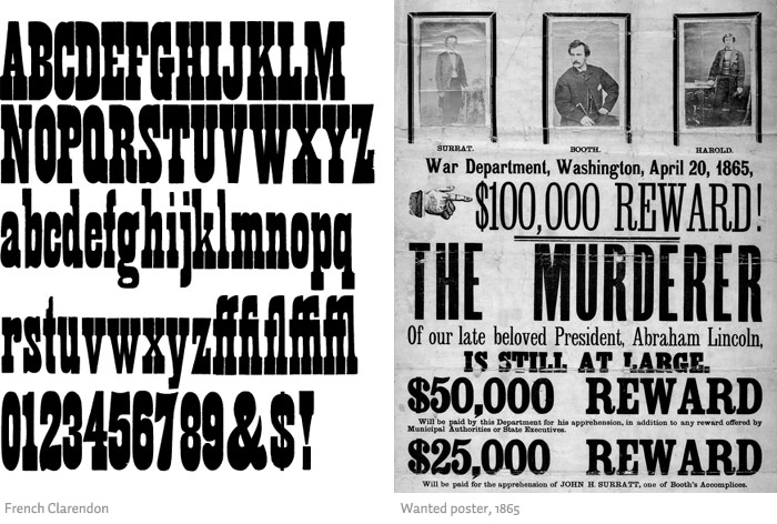
It's History: "Clarendon is a slab-serif typeface, and is considered to be the first registered typeface with the original matrices and punches remaining at Stephenson Blake and later residing at the Type Museum, London. They were marketed by Stephenson Blake as Consort, though some additional weights (a bold and italics) were cut in the 1950s. It was named after the Clarendon Press in Oxford. There’s only moderate contrast between thick and thin strokes, common of slab-serifs. It was originally designed by Robert Besley [in England] for the [Thorowgood and Co. then known as] Fann Street Foundry in 1845. It was later copied heavily by other foundries. Due to its popularity, Besley registered the typeface under Britain's Ornamental Designs Act of 1842. The patent expired three years later, and other foundries were quick to copy it." (Source #1 and #2)

"It was polished by Edouard Hoffmann and Hermann Eidenbenz at Haas Foundry a little over a century later. Haas’ revival of this typeface in 1953 precipitated the revivals that follow." (Source #3)

Picture found here.
What Type of Font It Is: Slab Serif. Slab Serif typefaces developed from large-scale display letters used in both woodblock letterpress printing and architectural lettering. The robust forms and substantial serifs of the Clarendons and Egyptians were perfectly suited to casting as relief forms in metal, and as a result they feature in many Victorian engineering projects as well as appearing in posters, playbills, and other promotional materials of the time.

"At their best, Slab Serifs are both robust and colorful, with the serifs providing a strong continuity of line. The historic Slab Serifs are generally most effective in the heavier weights. Clarendons, in particular, are useful in text setting, particularly in cases where a greater weight is required than might be provided by more traditional text faces." (Source #4)
Picture found here.
How You Can Design With It: "Clarendon is among the most evocative and colorful of the Victorian faces. The lighter weights are a later development that extends the functionality of the face, being more suitable for text setting than the bold form that is the basis of the genre. [....] Clarendon will hold its legibility fairly well when used as a screen font in web applications or when printed onto low-quality paper. [....] It is also effective for architectural and environmental applications, because the strong serif forms can be easily cut out and reproduced in three-dimensional media." (Source #5)

"Clarendon has strong letterforms common to slab serifs. It’s also a very readable typeface, which makes it appropriate for use at somewhat smaller sizes. Strong letterforms make Clarendon a great choice for things like signs, logos, and headlines. It’s already used by companies like Sony and Wells Fargo in their logos." (Source #1)

"The font was used extensively by the government of the German Empire for proclamations during World War I, and was also common in wanted posters of the American Old West. Craw Clarendon Bold was used by the United States National Park Service on traffic signs, but has been replaced by NPS Rawlinson Roadway. In 2008, the typeface was utilized extensively by the Ruby Tuesday restaurant chain in the re-launch of their corporate identity. Via, the travel magazine of the American Automobile Association, uses the typeface for its logo and headline copy." (Source #2)

Picture found here.
Where You Can Get It: You can purchase it at these locations for varying prices: Adobe, LinoType, FontShop, and MyFonts.

Descriptive Terms for It: Display, large blocks of text, old, poster design, serif, Slab Serif, Victorian, and whole family.

Sources:
- #1 - http://www.webdesignerdepot.com/2011/08/the-most-popular-fonts-used-by-designers/
- #2 - http://en.wikipedia.org/wiki/Clarendon_(typeface)
- #3 - http://www.myfonts.com/fonts/bitstream/clarendon/
- #4 - The Complete Typographer: A Manual for Designing with Type" by Will Hill, 2nd Edition, p. 102
- #5 - The Complete Typographer: A Manual for Designing with Type" by Will Hill, 2nd Edition, p. 104

Examples:
Picture found here.
Picture found here.
Picture found here.
Picture found here.