Showing posts with label Geometric. Show all posts

Tuesday, February 19, 2013

Typeface Review: "Avenir"

What It Looks Like:
Picture found here.
It's History: "Avenir is a geometric sans-serif typeface designed in 1988 by Adrian Frutiger. The name, Avenir, means “future” in French. It was designed to be a more humanistic version of traditional geometric typefaces like Futura. Upon release, it was available in three weights, using Frutiger’s two-digit weight and width naming convention: 45 (book) /46 (oblique), 55 (text) /56 (oblique), and 75 (bold) /76 (oblique). Three more weights were later added.

"Avenir is a relatively new typeface, but it’s become widely used. LG uses it for the buttons on most of their cell phones. BBC Two uses Avenir in its logo and identity. Dwell magazine started using it in 2007, and the upcoming J.J. Abrams film Super 8 also uses it for titles." (Source #1)

What Type of Font It Is: Geometric; "Geometric typefaces reflect the idea that type can be reduced to simple geometric units and cleansed of all historical associations. They are characteristic of the spirit of modernism that formed the dominant design ideology in Europe from the 1930s through the 1950s.

"Geometrics are, above all, the expression of an idea, and as such carry a set of associative values fitting them better for display and semi-display use." (Source #2)
Picture found here.
How You Can Design With It: "A balanced and restrained Geometric with a Humanist sensitivity in many of its letterforms, Avenir requires fairly loose letter spacing." (Source #2)

"Avenir’s greatest strengths are its simplicity and balance. It bridges the gap between geometric and humanist sans-serifs, making it a versatile, modern choice. Avenir is suitable for both headline and body copy. Improvements in hinting have made it better for on-screen viewing at smaller sizes." (Source #1)

Where You Can Get It: You can download a version for free using FontPalace, or you could buy a version of it from Fonts.com. There are also other versions that are like it and for free download:
Picture found here.
Descriptive Terms for It: Body copy, display, Geometric, headings, legible, modern, sans serif, simple, sub-headings, and versatile.

Sources:
- #1 - http://www.webdesignerdepot.com/2011/08/the-most-popular-fonts-used-by-designers/
- #2 - The Complete Typographer: A Manual for Designing with Type" by Will Hill, 2nd Edition, p. 134 and 141.
Examples:
Picture found here.


It isn't exactly like "Avenir", but it is like it and it is called "GatsbyFLF".
Picture found here.
Picture found here.

Monday, January 21, 2013

Typeface Review: "Futura"

What It Looks Like:
Picture found here.
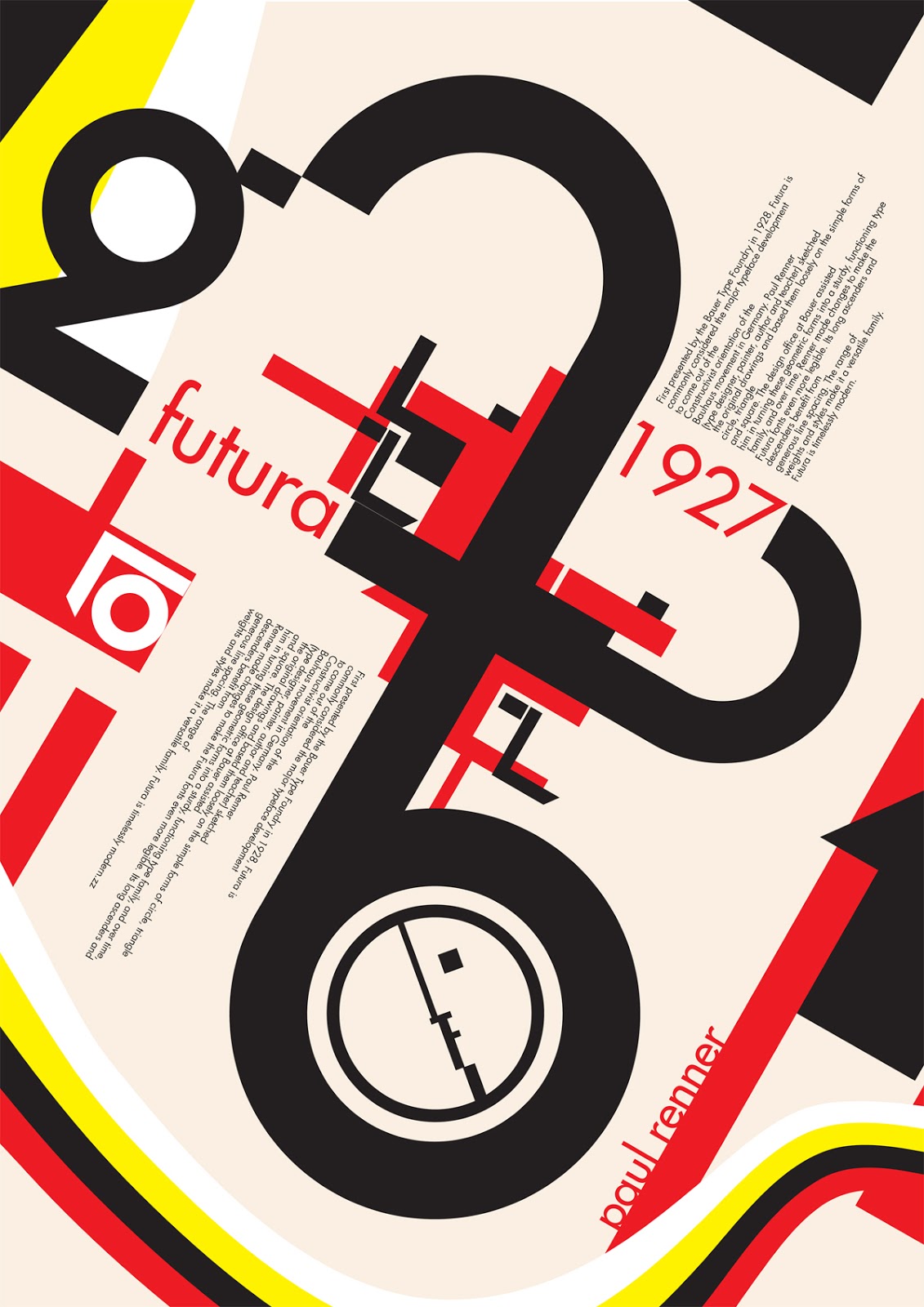
It's History: "Futura is a geometric sans-serif typeface that was commissioned by the Bauer type foundry in 1927. Originally, it included Light, Medium, Bold, and Bold Oblique fonts, and then later Light Oblique, Medium Oblique, Demibold, Demibold Oblique, Book, Extra Bold, and Extra Bold Italic fonts were released. (Source #1)

"Futura was designed by Paul Renner [in about 1924-1926 and was issued by the Bauer Foundry in 1927]. While he wasn’t associated with the Bauhaus, he shared the idea that a modern typeface should express modern models, rather than simply reviving an older design." (Source #1 and #2)
Picture found here.
What Type of Font Is It: Geometric; "Geometric typefaces reflect the idea that type can be reduced to simple geometric units and cleansed of all historical associations. They are characteristic of the spirit of modernism that formed the dominant design ideology in Europe from the 1930s through the 1950s." (Source #2)

"Futura has an efficient, forward appearance, and is derived from simple geometric forms. This is evident in the obvious influence of near-perfect circles, squares, and triangles. All non-essential elements were removed from the typeface, and the uppercase characters have proportions similar to classical Roman capitals." (Source #1)

How You Can Design With It:  "Futura is an excellent choice for advertising copy. It was used by IKEA until 2010, Volkswagen, Shell Petrol, and HP in their advertising and branding. Wes Anderson uses Futura for all of his films, and it was also Stanley Kubrick’s favorite font. It’s well suited to any modern design, for both headings and short copy." (Source #1)

Where You Can Get It: You can get it for free here:
http://www.linotype.com/472/futura-family.html.

Descriptive Terms For It: book copy, classic, Geometric, sans serif, variety, whole family.

Sources:
- #1 - http://www.webdesignerdepot.com/2011/08/the-most-popular-fonts-used-by-designers/
- #2 - The Complete Typographer: A Manual for Designing with Type" by Will Hill, 2nd Edition, p. 134 and 137
Examples:
Picture found here.
Picture found here.
Picture found here.
Picture found here.
Picture found here.

Monday, November 19, 2012

Typeface Review: "Gunship"

What It Looks Like: 

Its History: Created by Daniel Zadorozny, username "Iconian Fonts", pre-2005. Comes with a whole family of typefaces including Bold, Condensed, Expanded, Italic, Laser, Laser Italic, and "Leftalic", where it is italicized and pointing to the left hand corner.

What Type of Font It Is: Geometric; "Geometric typefaces reflect the idea that type can be reduced to simple geometric units and cleansed of all historical associations. They are characteristic of the spirit of modernism that formed the dominant design ideology in Europe from the 1930s through the 1950s." (Source below.)

How You Can Design With It: Meant mainly for display in large blocks of text as a way of grabbing someone's attention; logos, posters, book covers, large containers, etc.

Where You Can Get It: Nearly everywhere online for free; http://www.dafont.com/gunship.font,
http://cooltext.com/Download-Font-Gunshiphttp://www.urbanfonts.com/fonts/Gunship.htm, and http://fontzone.net/font-details/Gunship/, just to name a few.

Descriptive Terms For It: Geometric, large blocks of text, sans serif, open counters, whole family, variety, modern, science fiction, sci fi, display.

Sources: http://www.iconian.com/g.html, and "The Complete Typographer: A Manual for Designing with Type" by Will Hill, 2nd Edition, p. 134.


Examples: 
A similar typeface to "Gunship" was used throughout the Pixar movie, "Wall-E".
Got picture here.
A similar typeface to "Gunship" was used throughout the Pixar movie, "Wall-E".
Got picture here.
This picture also uses the typeface "Gunship".
Got picture here.