Showing posts with label variety. Show all posts

Tuesday, March 19, 2013

Typeface Review: "Garamond"

What It Looks Like:
Picture found here.
It's History: "Garamond is an old-style serif typeface, named after punch-cutter Claude Garamond. Adobe Garamond and Stempel Garamond were both based on this original typeface from the 16th century, and Granjon and Sabon were heavily influenced by it. There are a few unique characteristics of Garamond, including the small bowl of the lowercase 'a' and the small eye of the 'e'." (Source #1)

Claude Garamond's
portrait using the font
Garamond.
Picture found here.
"Robert Slimbach redesigned Garamond for Adobe in 1989. "Moderate contrast, and a more rounded form and evenness of stroke than Linotype or Stempel versions, make Slimbach's one of the most readable Garamonds. It is available with swash italics, some elegant terminal letters, ornaments, and titling capitols." (Source #2)

What Type of Font It Is: Garalde - "Garaldes include some of the most attractive and well-designed text faces in current use. They are highly legible but visually lively. As with most historically based faces, the adaptation of these letters for changing print technologies has had varying effects upon their integrity of form.

"All typefaces originating in hand-cut punches showed a considerable variation of form according to size, with the serifs relatively heavier and the modulation of stroke width less pronounced at smaller sizes. These considerations are crucial to the effective design or adaptation of Garalde faces, and distinguish quality recuts and original faces in the Garalde tradition."(Source #3)

Picture found here.
How You Can Design With It: "Garamond’s greatest strength is its legibility and readability. Garamond is one of the most legible serif typefaces, especially for use in print applications. It’s also one of the most eco-friendly typefaces in terms of ink usage. The original punches and matrices were sold to Christopher Plantin upon the death of Claude Garamond, and were in turn used in many printers, adding to its rise in popularity. Garamond revivals were created as early as 1900. Garamond is an excellent choice for printed materials, including books and reports, due to its high legibility in print." (Source #1)

Where You Can Get It: You can buy the font at FontShop. There is also an Apple site that let's you try it out before purchasing it, located here. Or download from a range of cheaper versions of it at DaFont.

Descriptive Terms for It: Book copy, Garalde, large blocks of text, large bodies of text, legible, Old Style, Old Style Serif, readable, redesign, variety, and whole family.

Sources:
- #1 - http://www.webdesignerdepot.com/2011/08/the-most-popular-fonts-used-by-designers/
- #2 - The Complete Typographer: A Manual for Designing with Type" by Will Hill, 2nd Edition, p. 80
- #3 - The Complete Typographer: A Manual for Designing with Type" by Will Hill, 2nd Edition, p. 72

Examples:
Picture found here.
Picture found here.
Picture found here and also available for purchase.
Picture found here.
Picture found here and also available for purchase.

Monday, February 4, 2013

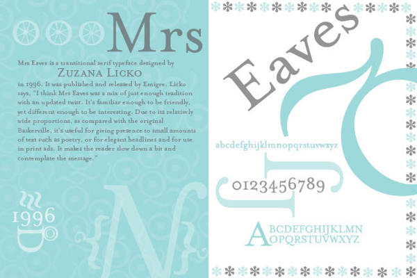
Typeface Review: "Mrs Eaves"

What It Looks Like:
Picture found here.
It's History: Created in 1996 by Zuzana Licko and licensed by Emigre Graphics, "a digital type foundry, publisher and distributor of graphic design centered information based in Berkeley, California, that was founded in 1984 by husband-and-wife team Rudy VanderLans and Zuzana Licko. The type foundry also published Emigre magazine between 1984 and 2005. Note that unlike the word émigré, Emigre is officially spelled without accents." (Source #1)

"Mrs Eaves is named after Sarah Eaves, the woman who became John Baskerville's wife. As Baskerville was setting up his printing and type business, Mrs. Eaves moved in with him as a live-in housekeeper, eventually becoming his wife after the death of her first husband, Mr. Eaves. Mrs Eaves is a revival of the types of English printer and punchcutter John Baskerville, and is related to contemporary Baskerville typefaces.

"Licko's selection of the name Mrs Eaves reveals an interesting story. Like his types, John Baskerville was, himself, a controversial character. He hired Sarah Eaves as his housekeeper. Eventually her husband Richard abandoned her and their five children, and Mrs Eaves became Baskerville's mistress and eventual helpmate with typesetting and printing. She married Baskerville within a month of her estranged husband's death. Selection of the name Mrs Eaves honors one of the forgotten women in the history of typography." (Source #2)
Picture found here.
What Type of Font It Is: Transitional: "Transitionals are, as a general rule, well suited to the setting of large bodies of text, as well as revealing considerable elegance of individual form when used for display purposes.... The italic fonts of Transitional typefaces were designed as an integral part of the face rather than as independent faces, and as a consequence reveal far greater affinity of form with the roman letters, while varying quite widely in style. They are better suited to use for emphasis or differentiation within roman text than the italics of Garalde or Humanist faces." (Source #3)

How You Can Design With It: Both elegant and with 213 ligatures, it is perfect for those who want classic style for their book or magazine.

"The typeface family includes roman, italic, petite capitals, small capitals, bold, and roman and italic ligatures. Ligatures in all variants of Mrs Eaves include the standard fi, ffi, andfl ligatures, and resurrect the classic eighteenth century ct and st ligatures. A Just Ligatures variant, available in roman and italic, contain a vast array of new ligatures, many incorporating intertwined and swash characters.

"The Mrs Eaves Ligatures sets include 213 ligatures, ranging from the common to the fanciful. The OpenType format fonts contain all 213 ligatures.

"The WordPress logotype is set in Mrs Eaves. It is also used for the titles (but not author names) on the covers and spines of the current Penguin Classics from Penguin Books. Blacktree's Quicksilver wordmark uses Mrs Eaves. Roman and petite caps. Bowdoin College uses Mrs Eaves in the college wordmark and in many other official materials. Radiohead's 2003 album Hail to the Thief prominently used Mrs Eaves in its related artworks." (Source #2)

Where You Can Get It: You may purchase various versions of Mrs Eaves via Emigre's website, located here: http://www.emigre.com/EF.php?fid=109.
Picture found here.

Descriptive Terms For It: book copy, classical, elegant, large bodies of text, legible, ligatures, pretty, serif, Transitional, versatile, variety, and whole family.

Sources:
- #1 - http://en.wikipedia.org/wiki/Emigre
- #2 - http://en.wikipedia.org/wiki/Mrs_Eaves
- #3 - "The Complete Typographer: A Manual for Designing with Type" by Will Hill, 2nd Edition, p. 84


Examples:
Picture found here.
Picture found here.
Picture found here.
Picture found here.
Picture found here.
Picture found here.
Picture found here.
Picture found here.

Tuesday, January 29, 2013

Typeface Review: "Univers"

What It Looks Like:
Picture found here.
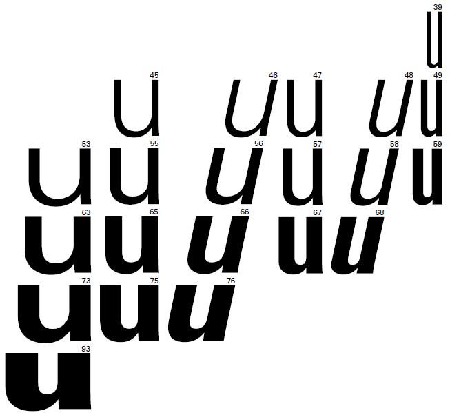
It's History: "Univers is a neo-grotesque sans serif typeface that was designed by Adrian Frutiger in 1954, and released by Deberny & Piegnot in 1957. It was then acquired by Haas in 1972, and later by D. Stempel AG and then Linotype.

"Univers is based on the 1898 typeface Akzidenz-Grotesk, which was also the basis for Helvetica (the two typefaces are sometimes confused). The entire Univers type family consists of 44 faces, with 16 uniquely numbered weight, width, and position combinations. Twenty of these fonts offer oblique characters, while eight support Central European character sets and another eight support Cyrillic characters." (Source #1)
Picture found here.
What Type of Font Is It: Neo-Grotesque; "Despite their origins as an expression of functionality and internationalism, 21st-century graphic design has seen increased use of Neo-Grotesques. Neo-Grotesques function better at small sizes than most other forms of sans serif, and they are consequently among the most suitable sans serif faces for long text setting. Their generous x-height and well-defined counters ensure page economy and legibility." (Source #2)

"The largest strength of Univers is its diversity, which is further enhanced by the number of weights available. It also has some of the same neutral character of Helvetica." (Source #1)

How You Can Design With It: "Univers is well-suited to a variety of designs, especially modern designs. It works well as both body copy and display." (Source #1)

"Univers is a durable face that can prove particularly useful when a wide range of differentiation is required. The condensed versions can be effectively used as text faces, allowing for setting to narrower columns than would normally be feasible." (Source #2)

Where You Can Get It: You can get it for free here:
http://www.linotype.com/search/univers#823a1cc7c532bf0877f557e08bf1b911.

Descriptive Terms For It: book copy, classic, Neo-Grotesque, sans serif, variety, whole family.

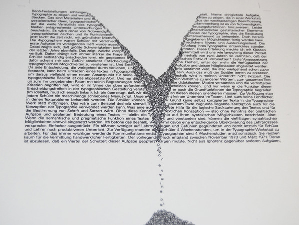
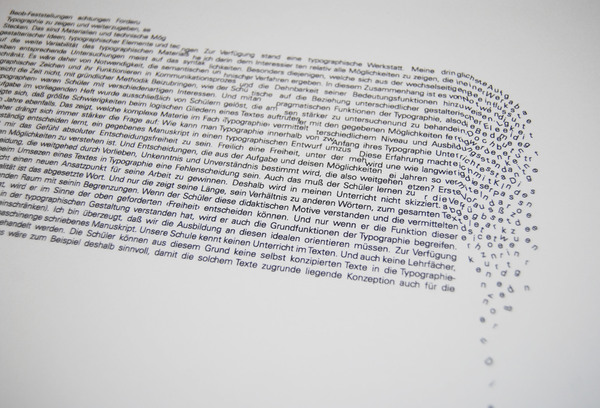
Extras: There was a typographic study of this illustrious font, which you can find here. It is actually quite beautiful in an architectural way. Here are two examples:

Picture found here.
Picture found here.


Sources:
- #1 - http://www.webdesignerdepot.com/2011/08/the-most-popular-fonts-used-by-designers/
- #2 - The Complete Typographer: A Manual for Designing with Type" by Will Hill, 2nd Edition, p. 126 and 129

Examples:
Picture found here.
Picture found here.
Picture found here.

Monday, January 21, 2013

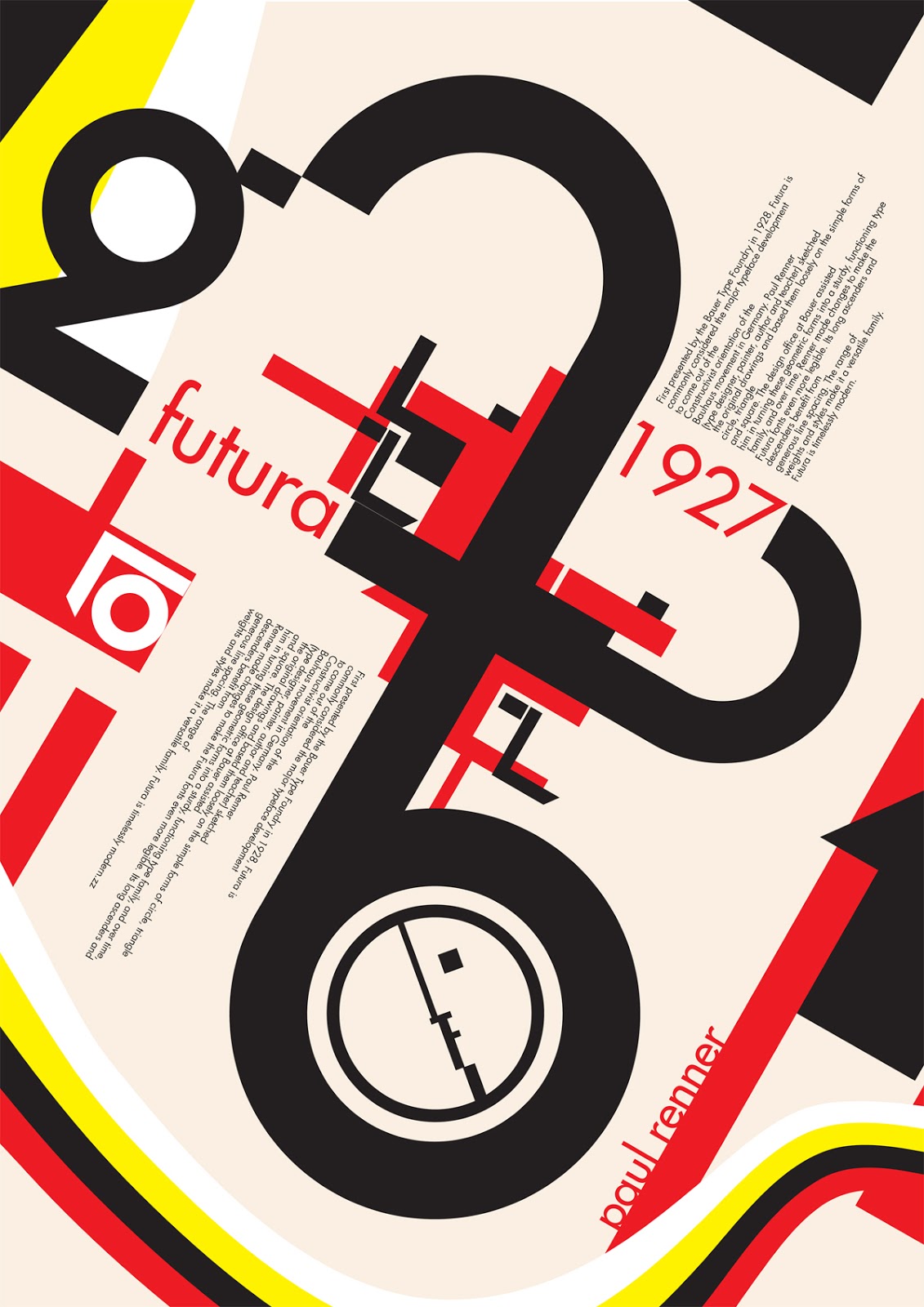
Typeface Review: "Futura"

What It Looks Like:
Picture found here.
It's History: "Futura is a geometric sans-serif typeface that was commissioned by the Bauer type foundry in 1927. Originally, it included Light, Medium, Bold, and Bold Oblique fonts, and then later Light Oblique, Medium Oblique, Demibold, Demibold Oblique, Book, Extra Bold, and Extra Bold Italic fonts were released. (Source #1)

"Futura was designed by Paul Renner [in about 1924-1926 and was issued by the Bauer Foundry in 1927]. While he wasn’t associated with the Bauhaus, he shared the idea that a modern typeface should express modern models, rather than simply reviving an older design." (Source #1 and #2)
Picture found here.
What Type of Font Is It: Geometric; "Geometric typefaces reflect the idea that type can be reduced to simple geometric units and cleansed of all historical associations. They are characteristic of the spirit of modernism that formed the dominant design ideology in Europe from the 1930s through the 1950s." (Source #2)

"Futura has an efficient, forward appearance, and is derived from simple geometric forms. This is evident in the obvious influence of near-perfect circles, squares, and triangles. All non-essential elements were removed from the typeface, and the uppercase characters have proportions similar to classical Roman capitals." (Source #1)

How You Can Design With It:  "Futura is an excellent choice for advertising copy. It was used by IKEA until 2010, Volkswagen, Shell Petrol, and HP in their advertising and branding. Wes Anderson uses Futura for all of his films, and it was also Stanley Kubrick’s favorite font. It’s well suited to any modern design, for both headings and short copy." (Source #1)

Where You Can Get It: You can get it for free here:
http://www.linotype.com/472/futura-family.html.

Descriptive Terms For It: book copy, classic, Geometric, sans serif, variety, whole family.

Sources:
- #1 - http://www.webdesignerdepot.com/2011/08/the-most-popular-fonts-used-by-designers/
- #2 - The Complete Typographer: A Manual for Designing with Type" by Will Hill, 2nd Edition, p. 134 and 137
Examples:
Picture found here.
Picture found here.
Picture found here.
Picture found here.
Picture found here.

Monday, December 3, 2012

Typeface Review: "Bank Gothic"

What It Looks Like:
Got picture here.
Its History: Created by Morris Fuller Benton in 1930, "'Bank Gothic' as a typeface made exclusively of small capitals, which adds to the technical impression it creates. Morris Fuller Benton took inspiration from a late-19th-century gravestone, whose inscription he recorded by taking a rubbing.

"In February 2007, Linotype released a wonderfully reinterpreted and expanded version of Bank Gothic, Morris Sans, designed by Dan Reynolds under type director Akira Kobayashi. For the first time, the geometric typeface was available in three weights and two widths, with a lowercase and a great number of extras. The new typeface takes its name from its original 'inventor'." (Source below.)

It is part of a family of fonts with a long range of varieties of weight such as Light, Light Condensed, Medium, Medium Condensed, Bold, and Bold Condensed.

Poster for the movie "I, Robot" featuring the typeface Bank Gothic.
Picture available here.
What Type of Font Is It: Grotesque Sans Serif - "developed in the 19th century, [they] evolved from display type, sign-writing, and architectural lettering. Grotesques combine legibility with visual interest and are well adapted to a range of functions, from informational signage to display typography, exploiting the dynamics of space, scale, and alignment." (Source below.)

How You Can Design With It: With its legibility useful as a way to communicate something in a short and bold burst of text, like a poster or book cover, but can also be used in smaller blocks of text.

Where You Can Get It: Available for a free download here: http://fontzone.net/font-details/BankGothic+Md+BT+Medium/ and http://www.fonts101.com/fonts/view/Uncategorized/53668/BankGothic. There are Bank Gothic Alternatives available for purchase here: http://www.fontshop.com/fontlist/alternatives/bank_gothic/.

Descriptive Terms For It: all-caps, classical, large blocks of text, modern, readable, sans serif, scifi, strong, technical, versatile, variety, and whole family.

Sources: http://luc.devroye.org/fonts-46711.htmlhttp://www.100besttypefaces.com/74_Bank+Gothic.html, "The Complete Typographer: A Manual for Designing with Type" by Will Hill, 2nd Edition, p. 118, and http://www.typeoff.de/2008/04/10/this-typeface-will-break-your-heart/.


Examples:
Poster for the movie "Gridiron Gang" featuring the typeface Bank Gothic.
Picture available here.
Poster for the movie "Event Horizon" featuring the typeface Bank Gothic.
Picture available here.
Poster for the movie "Ironman" featuring the typeface Bank Gothic.
Picture available here.

Monday, November 19, 2012

Typeface Review: "Gunship"

What It Looks Like: 

Its History: Created by Daniel Zadorozny, username "Iconian Fonts", pre-2005. Comes with a whole family of typefaces including Bold, Condensed, Expanded, Italic, Laser, Laser Italic, and "Leftalic", where it is italicized and pointing to the left hand corner.

What Type of Font It Is: Geometric; "Geometric typefaces reflect the idea that type can be reduced to simple geometric units and cleansed of all historical associations. They are characteristic of the spirit of modernism that formed the dominant design ideology in Europe from the 1930s through the 1950s." (Source below.)

How You Can Design With It: Meant mainly for display in large blocks of text as a way of grabbing someone's attention; logos, posters, book covers, large containers, etc.

Where You Can Get It: Nearly everywhere online for free; http://www.dafont.com/gunship.font,
http://cooltext.com/Download-Font-Gunshiphttp://www.urbanfonts.com/fonts/Gunship.htm, and http://fontzone.net/font-details/Gunship/, just to name a few.

Descriptive Terms For It: Geometric, large blocks of text, sans serif, open counters, whole family, variety, modern, science fiction, sci fi, display.

Sources: http://www.iconian.com/g.html, and "The Complete Typographer: A Manual for Designing with Type" by Will Hill, 2nd Edition, p. 134.


Examples: 
A similar typeface to "Gunship" was used throughout the Pixar movie, "Wall-E".
Got picture here.
A similar typeface to "Gunship" was used throughout the Pixar movie, "Wall-E".
Got picture here.
This picture also uses the typeface "Gunship".
Got picture here.

Monday, October 15, 2012

Typeface Review: "Eras ITC"

What It Looks Like:


Its History: Created by Albert Boton and Albert Hollenstein in 1976. Described as "a modernistic late 20th-century face, animated by asymmetrical curves and open counters." (Source below.) Comes with a variety of typefaces including Light, Medium, Contour, Black, Heavy Black, and Semi-Bold.

What Type of Font Is It: Humanist Sans Serif, "the term Humanist refers to faces based upon a classical or early Humanist model, in which the underlying proportions are derived from the Roman capital letter." (Source below.)

How You Can Design With It: Meant for the ease of reading large blocks of text, but it can also be used, in a large text size, as a way of grabbing someone's attention.

Where You Can Get It: You can get it for free here: http://fontzone.net/font-details/Eras+Normal/ or any innumerable places online.

Descriptive Terms For It: classical, ease of reading, large blocks of text, modern, sans serif, asymmetrical curves, open counters, whole family, variety.

Sources: http://fontzone.net/font-details/Eras+Normal/ and "The Complete Typographer: A Manual for Designing with Type" by Will Hill, 2nd Edition, p. 110 and 116.


Examples:
"Eras Bold ITC" typeface in use.
Picture found here.
"Eras Bold ITC" being used at the very top of the card.
Picture found here.