Showing posts with label logos. Show all posts

Wednesday, April 17, 2013

Typeface Review: "Bodoni"

What It Looks Like:
Picture found here.
It's History: "Bodoni is a modern serif typeface, with high contrast between thin and thick stroke weights, and a slightly condensed shape. It was based on the work of John Baskerville, but has taken his ideas to a more extreme conclusion. There are a few variations on Bodoni, some with more transitional shapes (including ITC Bodoni and Bodoni Old Face), and some more modern.

Picture found here.
"Bodoni was first designed by Giambattista Bodoni in 1798. In addition to the influence from Baskerville, Bodoni was also influenced heavily by the work of Pierre Simon Fournier and Firmin Didot." (Source #1)

What Type of Font It Is: Didone; "This category of types, also known as Modern, is based upon the typefaces produced in the late 18th and early 19th centuries in Italy by Giambattista Bodoni (1740 - 1813) and in France by Firmin Didot (1764 - 1836).

"Didones are most commonly used for display and semi-display purposes, where the accentuated contrasts of stroke width create dynamic and elegant graphic effects. While these characteristics are moderated in the smaller sizes to allow for their use in text setting, the extremes of contrast impair readability, making them a less practical choice where large amounts of copy are to be set." (Source #2)
Picture found here.
How You Can Design With It: "Bodoni, for the most part, is best suited to larger font sizes. Because of the extreme variation between thin and thick strokes, it can degrade at small sizes and become illegible (specifically, it creates an effect known as “dazzle”). There are some typeface variations though, that are optimized for use at smaller sizes (including Bodoni Old Face at 9 points, ITC Bodoni 12 at 12 points, and ITC Bodoni 7 at 7 points).

Picture found here.
"Bodoni is well-suited for use in modern designs where a serif typeface is desired. It’s a great serif for use in headlines and subheads, though some variations can be used for body copy, too. Some of its more recognizable uses can be found in the logo for grunge band Nirvana, and on the Mamma Mia! posters." (Source #1)

"Like most Didones, it can be effective in the setting of extended text, provided the printing and paper is of sufficient quality to ensure that the delicate hairlines and high contrasts are retained. All weights and widths of the Bodoni family can be used to dramatic effect as display faces." (Source #3)
Picture found here.
Where You Can Get It: You can download free versions of the font at FontSpace, UrbanFonts, CoolText, or DaFont. Or you can purchase the font at either MyFonts. There is also a newer version created by Heinrich Jost in 1926 called "Bauer Bodoni", which is slightly cheaper to purchase on websites, MyFonts and Linotype. (Source #3)

Descriptive Terms for It: Classic, Didone, display, large blocks of text, logo, logo design, logos, modern, old, and serif.

Sources:
- #1 - http://www.webdesignerdepot.com/2011/08/the-most-popular-fonts-used-by-designers/
- #2 - The Complete Typographer: A Manual for Designing with Type" by Will Hill, 2nd Edition, p. 94
- #3 - The Complete Typographer: A Manual for Designing with Type" by Will Hill, 2nd Edition, p. 96

Examples:
Picture found here.
Picture found here.
Picture found here.
Picture found here.


Picture found here.
Picture found here.
Picture found here.
Picture found here.
Picture found here.
Picture found here.
Picture found here.

Monday, March 11, 2013

Typeface Review: "Copperplate"

What It Looks Like:
Picture found here.
It's History: Designed by Frederic W. Goudy in 1901 and published by Apple Computer Inc. "Goudy is probably the best known of American typographers and exemplifies the Golden Age of American Printing. He is famous for his prodigious output; he designed over one-hundred typefaces, yet did not start design in earnest until he was 45.

"Born in Bloomington, Illinois, he studied at the Chicago School of Lettering. He best and most popular types are Goudy Old Style and Goudy Text. He was also well-known as a spokesperson for the trade and spent a great deal of time speaking in clubs, associations etc. He was not a 'modern'; he loved the 15th century and found much of his inspiration there.

" 'It is hardly possible to create a good typeface that will differ radically from the established forms of the past; nevertheless, it is still possible to secure new expressions of life and vigour.' " (Source #1)

"Originally designed in 1901, Copperplate Gothic was first released as a font family containing several weights and condensed variations. The font name reflects the popularity of this particular style of typeface during the time that copperplate engraving was a popular technique for reproducing illustrated material; from about 1530 up to the 19th century. Although a true lowercase has never been designed, Copperplate Gothic is ideal for all-capital text typically set in small print. For example, it's very popular for use on business cards. Tiny serifs lend Copperplate Gothic a distinctive feel. The design captures both the sturdiness of a sans serif, as well as the elegance of typefaces with serifs." (Source #2)
Picture found here.
What Type of Font It Is: Glyphic; "Glyphics are primarily a titling form and many have no lowercase. Some of the Germanic Glyphics can be effectively used for limited amounts of text setting, providing a tonal depth similar to that of the heavier Humanist revival faces. Their weight can create more dramatic color in a text page but their application in this context is very specialized." (Source #3)

"Misleadingly titled, this is a Gothic with a Glyphic accent in its very subtle flare serifs. It has no lowercase, and is available in a range of numbered weights and widths." (Source #4)

How You Can Design With It: "You may have been scrolling down your list of fonts on Microsoft Word or PowerPoint one day and thought, 'Hey, that's a cool, subtly seriffed font. It's nice and wide. It looks classy, and yet I don't think I'd want to pick a fight with that font. I'm going to use that font for my poster/presentation.' " (Source #5)

Where You Can Get It: You can download the font for free at FontZone and Fonts101. There are also fonts very similar to Copperplate, available to buy at FontSpring.

Descriptive Terms for It: All-caps, business cards, Capital Only, classy, Frederic Goudy, Glyphic, legible, and logos.

Sources:
- #1 - http://www.identifont.com/show?13B
- #2 - http://www.microsoft.com/typography/fonts/family.aspx?FID=40
- #3 - The Complete Typographer: A Manual for Designing with Type" by Will Hill, 2nd Edition, p. 142
- #4 - The Complete Typographer: A Manual for Designing with Type" by Will Hill, 2nd Edition, p. 148
- #5 - http://lifeatluther.blogspot.com/2008/02/copperplate-font-must-be-stopped.html

Examples:
Picture found here.
Picture found here.
Picture found here.
Picture found here.
Picture found here.
Picture found here.

Friday, February 1, 2013

Graphic Designer of the Month: Paul Rand

Picture found here.
Book cover design
by Paul Rand.
Picture found here.
A Short Biography: The man who made corporate America cool was born named Peretz Rosenbaum (Source #1) on August 15th, 1914 in Brooklyn, New York. "He embraced design at a very young age, painting signs for his father's grocery store as well as for school events at P.S. 109. Rand's father did not believe art could provide his son with a sufficient livelihood, and so he required Paul to attend Manhattan's Harren High School while taking night classes at the Pratt Institute, Rand was largely "self-taught as a designer, learning about the works of Cassandre (pseudonym of Adolphe Jean-Marie Mouron) and LĆ”szló Moholy-Nagy from European magazines such as Gebrauchsgraphik.


Book covers designed
by Paul Rand.
Picture found here.
"Rand was educated at the Pratt Institute (1929–1932), Parsons The New School for Design (1932–33), and the Art Students League(1933–1934). From 1956 to 1969, and beginning again in 1974, Rand taught design at Yale University in New Haven, Connecticut. Rand was inducted into the New York Art Directors Club Hall of Fame in 1972.

"Rand devoted his final years to design work and the writing of his memoirs. In 1996, he died of cancer at age 82 (November 26th, 1996) in Norwalk, Connecticut. He is buried in Beth El Cemetery." (Source #2)
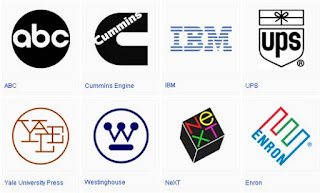
Logos designed by Paul Rand. Picture found here.
What Was His Specialty:
"The International Typographic Style, also known as the Swiss Style, is a graphic design style developed in Switzerland in the 1950s that emphasizes cleanliness, readability and objectivity. Hallmarks of the style are asymmetric layouts, use of a grid, sans-serif typefaces like Akzidenz Grotesk, and flush left, ragged right text. The style is also associated with a preference for photography in place of illustrations or drawings. Many of the early International Typographic Style works featured typography as a primary design element in addition to its use in text, and it is for this that the style is named.

Book cover design
by Paul Rand.
Picture found here.
"Other designers who use this Max Bill, Adrian Frutiger, Armin Hofmann, Richard Paul Lohse, Josef Müller-Brockmann, Emil Ruder, and Jan Tschichold." (Source #3)

About His Work & Influences: "Though Rand was a recluse in his creative process, doing the vast majority of the design load despite having a large staff at varying points in his career, he was very interested in producing books of theory to illuminate his philosophies. LĆ”szló Moholy-Nagy may have incited Rand's zeal for knowledge when he asked his colleague if he read art criticism at their first meeting. Rand said no, prompting Moholy-Nagy to reply "Pity." Steven Heller ( wrote "Thoughts on Rand" for Print magazine in May–June 1997 edition) elaborates on this meeting's impact, noting that, "from that moment on, Rand devoured books by the leading philosophers on art, including Roger Fry, Alfred North Whitehead, and John Dewey." These theoreticians would have a lasting impression on Rand's work; in a 1995 interview with Michael Kroeger discussing, among other topics, the importance of Dewey's Art as Experience, Rand elaborates on Dewey's appeal:


Book cover design
by Paul Rand.
Picture found here.
'[. . . Art as Experience] deals with everything — there is no subject 
he does not deal with. That is why it will take you one hundred years 
to read this book. Even today's philosophers talk about it[.] 
[E]very time you open this book you find good things. 
I mean the philosophers say this, not just me. You read this, 
then when you open this up next year, that you read something new.'

"Dewey is an important source for Rand's underlying sentiment in graphic design; on page one of Rand's groundbreaking Thoughts on Design, the author begins drawing lines from Dewey's philosophy to the need for "functional-aesthetic perfection" in modern art. Among the ideas Rand pushed in Thoughts on Design was the practice of creating graphic works capable of retaining recognizable quality even after being blurred or mutilated, a test Rand routinely performed on his corporate identities." (Source #2)

A set of children's books
designed by Paul Rand.
Picture found here.
Where He Can Be Found: Though this great designer is dead, his website is located here at http://www.paul-rand.com/, with a simple aesthetic I think he would be most proud of.

Effect On Graphic Design: "Rand's most widely known contributions to design are his corporate identities, many of which are still in use. IBM, ABC, Cummins Engine, UPS, and the now-infamous Enron, among many others, owe Rand their graphical heritage. One of his strengths, as Moholy-Nagy pointed out, was his ability as a salesman to explain the needs his identities would address for the corporation. According to graphic designer Louis Danziger:


'He almost singlehandedly convinced business that design 
was an effective tool. [. . .] Anyone designing in the 1950s and 1960s 
owed much to Rand, who largely made it possible 
for us to work. He more than anyone else made the profession 
reputable. We went from being commercial artists to being 
graphic designers largely on his merits.'

Book cover design
by Paul Rand.
Picture found here.
"Although his logos may be interpreted as simplistic, Rand was quick to point out in A Designer's Art that 'ideas do not need to be esoteric to be original or exciting.' His American Broadcasting Company trademark, created in 1961, then used by ABC-TV in the fall of 1962, epitomizes that ideal of minimalism while proving Rand's point that a logo 'cannot survive unless it is designed with the utmost simplicity and restraint.' Rand remained vital as he aged, continuing to produce important corporate identities into the eighties and nineties with a rumored $100,000 price per single solution. The most notable of his later works was his collaboration with Steve Jobs for the NeXT Computer corporate identity; Rand's simple black box breaks the company name into two lines, producing a visual harmony that endeared the logogram to Jobs. Steve Jobs was pleased: just prior to Rand's death in 1996, his former client labeled him, simply, 'the greatest living graphic designer.' " (Source #2)

Paul Rand's book
Thoughts On Design.
Picture found here.
Bibliography: 
  • Rand, Paul (1970). Thoughts On Design. Studio Vista Van Nostrand Reinhold. ISBN 978-0289798362.
  • Rand, Paul (1985). Paul Rand: A Designer's Art. New Haven: Yale University Press. ISBN 978-0300082821.
  • Rand, Paul (1994). Design, Form, and Chaos. New Haven: Yale University Press. ISBN 978-0300055535.
  • Rand, Paul (1996). From Lascaux to Brooklyn. New Haven: Yale University Press. ISBN 978-0300066760.


Sources:
- #1 - http://www.kettererkunst.com/bio/paul-rand-1914.shtml
- #2 - http://en.wikipedia.org/wiki/Paul_Rand
- #3 - http://en.wikipedia.org/wiki/International_Typographic_Style

Also, this video, which I first saw here: 

Monday, December 31, 2012

Typeface Review: "Crescendo"

What It Looks Like:
Picture available here.
Its History: "Designed by Patrick Griffin and Nancy Harris Rouemy in 2011 and published by Canada Type." (Source #1)

"Canada Type is an independent font development studio based in Toronto. The studio was founded in 2004 by Rebecca Alaccari and Patrick Griffin, as a means to perform professional type solutions to creative indviduals and departments all over the world." (Source #2)

What Type of Font It Is: Ornamental - "the form of the letter itself is determined by some decorative or figurative intention. The Ornamental form may thus be composed of foliage, rustic woodwork, the human form, or abstract elements. The majority of Ornamental faces from the 19th century are capital only, and necessarily designed for use at larger sizes." (Source #3)


Picture available here.
How You Can Design With It: Meant mainly to be used as a display text. Best used in logos, posters, book covers, large containers, etc. "Decorative and Ornamental letters are, by definition, display faces and seldom, if ever, suited to the setting of any more than a small number of words." (Source #3)

Where You Can Get It: Available for purchase here: http://www.fontshop.com/search/?q=Crescendo.

Descriptive Terms For It: 1920s, art deco, art nouveau, book covers, decorative, display, flapper, poster, poster design, posters, logo, logo design, logos, and ornamental.

Sources:
-#1 - http://www.fontshop.com/fonts/downloads/canada_type/crescendo_ot/
-#2 - http://www.fontshop.com/fonts/foundry/canada_type/
-#3 - "The Complete Typographer: A Manual for Designing with Type" by Will Hill, 2nd Edition, p. 160

Examples:
Picture available here.