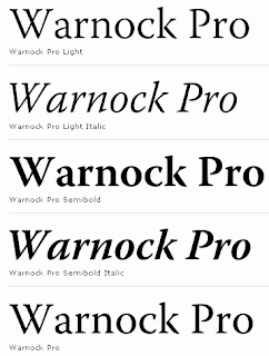
What It Looks Like:
 |
| Picture found here. |
 |
| Picture found here. |
"A full-featured, state-of-the-art OpenType family - with Latin, Cyrillic, and Greek character sets in a variety of weights and optical size ranges-Warnock Pro is a classic yet contemporary composition family that performs a wide variety of typographic tasks with elegance." (Source #1)
 |
| Picture found here. |
How You Can Design With It: "Transitionals are, as a general rule, well suited to the setting of large bodies of text, as well as revealing considerable elegance of individual form when used for display purposes.... The italic fonts of Transitional typefaces were designed as an integral part of the face rather than as independent faces, and as a consequence reveal far greater affinity of form with the roman letters, while varying quite widely in style. They are better suited to use for emphasis or differentiation within roman text than the italics of Garalde or Humanist faces." (Source #3)
 |
| Picture found here. |
Descriptive Terms for It: Classic, display, elegant, large blocks of text, large bodies of text, serif, Transitional, and whole family.
Extra: There's even an open letter, penned by Andrei Michael Herasimchuk of Design By Fire, to JohnWarnock to make his namesake a part of the public domain, as well as other typefaces such as Adobe Caslon Pro, Adobe Jenson Pro, Franklin Gothic, Frutiger, Futura, Gill Sans, Helvetica Neue, and Univers.
Sources:
- #1 - http://www.myfonts.com/fonts/adobe/warnock/
- #2 - "The Complete Typographer: A Manual for Designing with Type" by Will Hill, 2nd Edition, p. 91
- #3 - "The Complete Typographer: A Manual for Designing with Type" by Will Hill, 2nd Edition, p. 84


No comments:
Post a Comment