What It Looks Like:
It's History: Created in 1996 by Zuzana Licko and licensed by Emigre Graphics, "a digital type foundry, publisher and distributor of graphic design centered information based in Berkeley, California, that was founded in 1984 by husband-and-wife team Rudy VanderLans and Zuzana Licko. The type foundry also published
Emigre magazine between 1984 and 2005. Note that unlike the word émigré, Emigre is officially spelled without accents."
(Source #1)
"
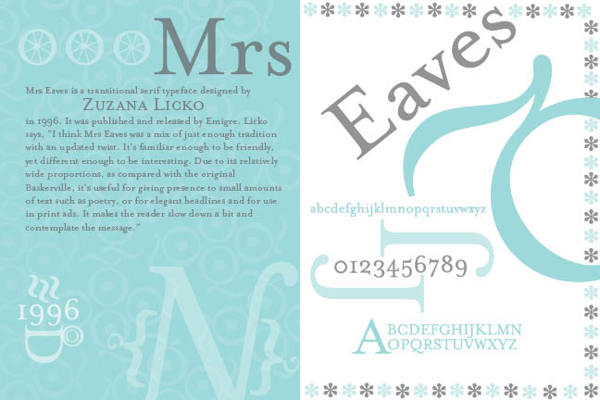
Mrs Eaves is named after Sarah Eaves, the woman who became John Baskerville's wife. As Baskerville was setting up his printing and type business, Mrs. Eaves moved in with him as a live-in housekeeper, eventually becoming his wife after the death of her first husband, Mr. Eaves. Mrs Eaves is a revival of the types of English printer and punchcutter John Baskerville, and is related to contemporary Baskerville typefaces.
"Licko's selection of the name
Mrs Eaves reveals an interesting story. Like his types, John Baskerville was, himself, a controversial character. He hired Sarah Eaves as his housekeeper. Eventually her husband Richard abandoned her and their five children, and Mrs Eaves became Baskerville's mistress and eventual helpmate with typesetting and printing. She married Baskerville within a month of her estranged husband's death. Selection of the name Mrs Eaves honors one of the forgotten women in the history of typography."
(Source #2)
What Type of Font It Is: Transitional: "Transitionals are, as a general rule, well suited to the setting of large bodies of text, as well as revealing considerable elegance of individual form when used for display purposes.... The italic fonts of Transitional typefaces were designed as an integral part of the face rather than as independent faces, and as a consequence reveal far greater affinity of form with the roman letters, while varying quite widely in style. They are better suited to use for emphasis or differentiation within roman text than the italics of Garalde or Humanist faces."
(Source #3)
How You Can Design With It: Both elegant and with 213 ligatures, it is perfect for those who want classic style for their book or magazine.
"The typeface family includes roman, italic, petite capitals, small capitals, bold, and roman and italic ligatures. Ligatures in all variants of Mrs Eaves include the standard fi, ffi, andfl ligatures, and resurrect the classic eighteenth century ct and st ligatures. A Just Ligatures variant, available in roman and italic, contain a vast array of new ligatures, many incorporating intertwined and swash characters.
"The Mrs Eaves Ligatures sets include 213 ligatures, ranging from the common to the fanciful. The OpenType format fonts contain all 213 ligatures.
"The
WordPress logotype is set in
Mrs Eaves. It is also used for the titles (but not author names) on the covers and spines of the current
Penguin Classics from
Penguin Books. Blacktree's
Quicksilver wordmark uses
Mrs Eaves. Roman and petite caps. Bowdoin College uses
Mrs Eaves in the college wordmark and in many other official materials. Radiohead's 2003 album
Hail to the Thief prominently used
Mrs Eaves in its related artworks."
(Source #2)Where You Can Get It: You may purchase various versions of
Mrs Eaves via Emigre's website, located here:
http://www.emigre.com/EF.php?fid=109.
Descriptive Terms For It: book copy, classical, elegant, large bodies of text, legible, ligatures, pretty, serif, Transitional, versatile, variety, and whole family.
Sources:
- #1 - http://en.wikipedia.org/wiki/Emigre
- #2 - http://en.wikipedia.org/wiki/Mrs_Eaves
- #3 - "The Complete Typographer: A Manual for Designing with Type" by Will Hill, 2nd Edition, p. 84
Examples:


No comments:
Post a Comment