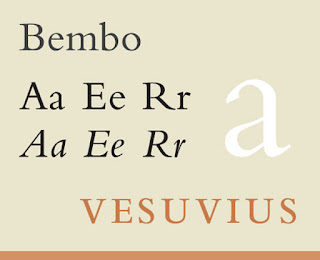
What It Looks Like:
 |
| Picture originally found here. |
"Since the original typeface had no italic cut with it, it’s rumored that renowned calligrapher Alfred Fairbank was commissioned by Stanley Fairbank to create an italic for Bembo. Fairbank maintains that he created the type independently and then sold it to Monotype, but in either case, the metal type for an italic version of Bembo was released in 1929." (Source #1)
 |
| Picture originally found here. |
What Type of Font Is It: "Bembo is an old style serif, based on a humanist typeface created by Francesco Griffo in the late 15th century. It has a number of characteristics of humanist typefaces, including minimal variation between the weights of thin and thick strokes; a small x-height; short, bracketed serifs; angled top serifs on lower-case letters; and ascenders that are taller than capital letters." (Source #1)
How You Can Design With It: "Bembo is considered a good classical typeface, with a strong humanist, Old Style look. It’s perfect for use in designs where classic beauty or formal tradition are important. [It] is considered a good choice for book typography." (Source #1)
Where You Can Get It: You can get it for free here:
Extras: A rather interesting article chastising designers for the overuse of Bembo located here, with the lovely people at ILoveTypography. Also, this excellent site featuring the font to make animals out of the letters of it's name, including sound effects: http://www.bemboszoo.com/.
Sources:
- #1 - http://www.webdesignerdepot.com/2011/08/the-most-popular-fonts-used-by-designers/
Examples:
 |
| Picture originally found here. |
 |
| Picture originally found here. |
 |
| Picture originally found here. |
 |
| Picture originally found here. |
 |
| Picture originally found here. |

No comments:
Post a Comment